4. MatPlotLib#
1. Introduction to Pyplot#
Matplotlib (https://matplotlib.org/) is a comprehensive library for creating static, animated, and interactive visualizations in Python. It’s one of the most popular plotting libraries in the Python ecosystem. Matplotlib is built on Numpy and so we often import them together
To install matplotlib (be sure to be in proper virtual environment)
conda install -c conda-forge matplotlib
There are two basic ways to use MatPlotlib, either through the PyPlot submodule or through an object oriented approach where programs use the objects within MatPlotlib.
Pyplot vs. Object-Oriented Approach:#
Feature |
Pyplot (Stateful) |
Object-Oriented (OO) |
|---|---|---|
Figure creation |
|
|
Plotting |
|
|
Labels, title, etc. |
|
|
Layout adjustment |
|
|
Use of figure/axes objects |
No |
Yes (explicit |
In this class we will use matplotlib.pyplot approach and import it into our Jupyter notebooks through the following command
To import
import matplotlib.pyplot as plt
import numpy as np
Pyplot (often imported as plt) is a module within Matplotlib that provides a simple, MATLAB-like interface for plotting. It’s designed to make common plotting tasks easy and accessible, especially for users familiar with MATLAB’s plotting commands.
1.1: Pyplot classes#
Pyplot itself is not a class, but rather a module that provides a MATLAB-like interface to Matplotlib. However, it interacts with and creates instances of several important classes within the Matplotlib ecosystem. Here are some key points:
Figure Class: Pyplot creates and manages instances of the
Figureclass. TheFigureclass is the top-level container for all plot elements[1].Axes Class: When you create plots using pyplot functions, you’re often working with instances of the
Axesclass, which represent individual plotting areas within a figure.Canvas Class: The
FigureCanvasis indeed a class, and it’s crucial in Matplotlib’s architecture. It’s the object that actually does the drawing of the figure.FigureManager Class: This class is responsible for managing the interaction between the
Figureand the backend.
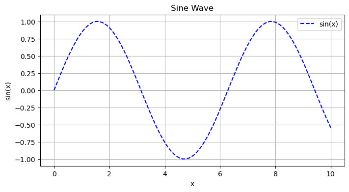
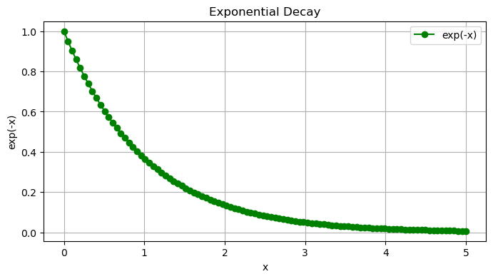
2. Generating a Figure#
Each plt.fig() statement in the following code block creates an independent figure state, and the subsequent plotting commands only apply to that figure.
import matplotlib.pyplot as plt
import numpy as np

# Data for Plot 1
x1 = np.linspace(0, 10, 100)
y1 = np.sin(x1)

# First Figure
plt.figure(figsize=(8, 4))
plt.plot(x1, y1, label='sin(x)', color='blue', linestyle='--')
plt.title("Sine Wave")
plt.xlabel("x")
plt.ylabel("sin(x)")
plt.legend()
plt.grid(True)
plt.show()

# Data for Plot 2
x2 = np.linspace(0, 5, 100)
y2 = np.exp(-x2)

# Second Figure
plt.figure(figsize=(8, 4))
plt.plot(x2, y2, label='exp(-x)', color='green', marker='o')
plt.title("Exponential Decay")
plt.xlabel("x")
plt.ylabel("exp(-x)")
plt.legend()
plt.grid(True)
plt.show()
2.1 Understanding plt.functions in the figure#
Lets look at the following block of code
plt.figure(figsize=(8, 4))
plt.plot(x1, y1, label='sin(x)', color='blue')
plt.title("Sine Wave")
plt.xlabel("x")
plt.ylabel("sin(x)")
plt.legend()
plt.grid(True)
plt.show()
Function |
Purpose |
Key Parameters |
|---|---|---|
|
Create a new figure (canvas) |
|
|
Plot data as a line |
|
|
Add plot title |
|
|
Label x-axis |
|
|
Label y-axis |
|
|
Display legend box |
optional: |
|
Add grid lines |
|
|
Render and display plot |
None |
3. Pyplot Functions#
Method |
Description |
|---|---|
|
Creates a line or scatter plot |
|
Creates a scatter plot |
|
Creates a bar plot |
|
Creates a histogram |
|
Creates a box and whisker plot |
|
Displays an image on a 2D regular raster |
|
Draws contour lines |
|
Draws filled contours |
|
Plots a 2D field of arrows |
|
Creates a pie chart |
|
Plots y versus x as lines and/or markers with attached error bars |
|
Adds a subplot to the current figure |
|
Creates a new figure or activates an existing figure |
|
Sets a title for the current axes |
|
Sets a label for the x-axis |
|
Sets a label for the y-axis |
|
Places a legend on the axes |
|
Configures the grid lines |
|
Gets or sets the x limits of the current axes |
|
Gets or sets the y limits of the current axes |
|
Saves the current figure |
|
Displays all open figures |
|
Closes a figure window |
|
Adds a colorbar to a plot |
|
Sets the color limits of the current image |
|
Adds text to the axes |
|
Annotates a point with text |
3.1 pyplot.plot()#
plplot.plot arguments#
Argument |
Description |
|---|---|
x |
The horizontal coordinates of the data points. Optional if y is given as a 2D array. |
y |
The vertical coordinates of the data points. |
fmt |
A format string that specifies the color, marker, and line style. Optional. |
color |
The color of the line or markers. Can be a string or RGB tuple. |
linestyle |
The style of the line. Examples: ‘-’, ‘–’, ‘:’, ‘-.’ |
linewidth |
The width of the line in points. |
marker |
The style of markers to use. Examples: ‘o’, ‘s’, ‘^’, ‘D’ |
markersize |
The size of markers in points. |
label |
A string that will be used in the legend for this line. |
alpha |
The transparency of the line/markers (0.0 to 1.0). |
data |
An object with labelled data, allowing use of string identifiers for x and y. |
scalex, scaley |
Booleans indicating whether to autoscale x and y axes. Default is True. |
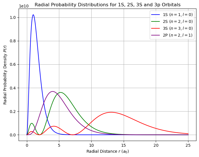
4. Plots from Equations#
Radial Wavefunction for Hydrogen-like Atoms#
The radial part of the wavefunction is given by:
where
and the normalization factor \( N_{nl}\) is:
The radial probability density is:
where ( a_0 ) is the Bohr radius.
import numpy as np
import matplotlib.pyplot as plt
from scipy.special import genlaguerre
from scipy.constants import physical_constants
import math

# Constants
a0 = physical_constants['Bohr radius'][0]  # Bohr radius in meters

# Define the radial wave function for hydrogen-like atoms
def radial_wavefunction(n, l, r):
    """Computes the radial wavefunction R_{n,l}(r) for hydrogen-like atoms."""
    rho = 2 * r / (n * a0)
    norm_factor = np.sqrt((2 / (n * a0))**3 * math.factorial(n - l - 1) / (2 * n * math.factorial(n + l)))
    #norm_factor = np.sqrt((2 / (n * a0))**3 * np.math.factorial(n - l - 1) / (2 * n * np.math.factorial(n + l)))
    laguerre_poly = genlaguerre(n - l - 1, 2 * l + 1)
    radial_part = np.exp(-rho / 2) * rho**l * laguerre_poly(rho)
    return norm_factor * radial_part

# Define radial probability density P(r) = r^2 * |R_{n,l}(r)|^2
def radial_probability(n, l, r):
    R = radial_wavefunction(n, l, r)
    return r**2 * R**2


# Radial range
r_values = np.linspace(0, 25 * a0, 500)  # Up to 10 Bohr radii

# Compute radial probability densities
prob_1s = radial_probability(1, 0, r_values)
prob_2s = radial_probability(2, 0, r_values)
prob_3s = radial_probability(3, 0, r_values)
prob_2p = radial_probability(2, 1, r_values)
# Plot
plt.figure(figsize=(8, 6))
plt.plot(r_values / a0, prob_1s, label=r'1S ($n=1, l=0$)', color='b')
plt.plot(r_values / a0, prob_2s, label=r'2S ($n=2, l=0$)', color='g')
plt.plot(r_values / a0, prob_3s, label=r'3S ($n=3, l=0$)', color='r')
plt.plot(r_values / a0, prob_2p, label=r'2P ($n=2, l=1$)', color='purple')

# Labels and title
plt.xlabel(r'Radial Distance $r$ ($a_0$)')
plt.ylabel(r'Radial Probability Density $P(r)$')
plt.title('Radial Probability Distributions for 1S, 2S, 3S and 3p Orbitals')
plt.legend()
plt.grid(True)

# Show plot
plt.show()
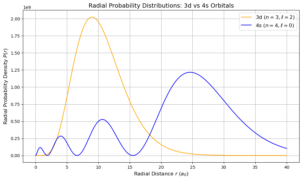
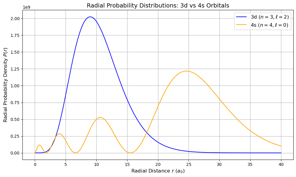
Radial Probability Densities: 3d vs 4s Orbitals#
The radial probability density is defined as:
where \( R_{n,l}(r)\) is the radial wavefunction for hydrogen-like atoms.
3d orbital: n = 3, l = 2
4s orbital: n = 4, l = 0
The 4s orbital shows significant penetration closer to the nucleus and also extends farther out than the 3d orbital. This behavior explains trends in electron configurations and chemical reactivity in the periodic table.
import numpy as np
import matplotlib.pyplot as plt
from scipy.special import genlaguerre
from scipy.constants import physical_constants
import math

# Constants
a0 = physical_constants['Bohr radius'][0]  # Bohr radius in meters

# Radial wavefunction R_{n,l}(r)
def radial_wavefunction(n, l, r):
    rho = 2 * r / (n * a0)
    norm_factor = np.sqrt((2 / (n * a0))**3 * math.factorial(n - l - 1) / (2 * n * math.factorial(n + l)))
    laguerre_poly = genlaguerre(n - l - 1, 2 * l + 1)
    radial_part = np.exp(-rho / 2) * rho**l * laguerre_poly(rho)
    return norm_factor * radial_part

# Radial probability density P(r) = r^2 * |R_{n,l}(r)|^2
def radial_probability(n, l, r):
    R = radial_wavefunction(n, l, r)
    return r**2 * R**2

# Radial distances
r_values = np.linspace(0, 40 * a0, 1000)  # Up to 20 Bohr radii for better comparison

# Compute radial probability densities
prob_3d = radial_probability(3, 2, r_values)
prob_4s = radial_probability(4, 0, r_values)

# Plot
plt.figure(figsize=(10, 6))
plt.plot(r_values / a0, prob_3d, label=r'3d ($n=3, \ell=2$)', color='orange')
plt.plot(r_values / a0, prob_4s, label=r'4s ($n=4, \ell=0$)', color='blue')
plt.xlabel(r'Radial Distance $r$ ($a_0$)', fontsize=12)
plt.ylabel(r'Radial Probability Density $P(r)$', fontsize=12)
plt.title('Radial Probability Distributions: 3d vs 4s Orbitals', fontsize=14)
plt.legend(fontsize=12)
plt.grid(True)
plt.tight_layout()
plt.show()
import numpy as np
import matplotlib.pyplot as plt
from scipy.special import genlaguerre
from scipy.constants import physical_constants
import math  # Use math.factorial for scalars

# Constants
a0 = physical_constants['Bohr radius'][0]  # Bohr radius in meters

# Radial wavefunction R_{n,l}(r)
def radial_wavefunction(n, l, r):
    rho = 2 * r / (n * a0)
    norm_factor = np.sqrt((2 / (n * a0))**3 * math.factorial(n - l - 1) / (2 * n * math.factorial(n + l)))
    laguerre_poly = genlaguerre(n - l - 1, 2 * l + 1)
    radial_part = np.exp(-rho / 2) * rho**l * laguerre_poly(rho)
    return norm_factor * radial_part

# Radial probability density P(r) = r^2 * |R_{n,l}(r)|^2
def radial_probability(n, l, r):
    R = radial_wavefunction(n, l, r)
    return r**2 * R**2

# Radial distance values (0 to 40 Bohr radii)
r_values = np.linspace(0, 40 * a0, 1000)

# Compute probability densities for 3d and 4s
prob_3d = radial_probability(3, 2, r_values)
prob_4s = radial_probability(4, 0, r_values)

# Plot
plt.figure(figsize=(10, 6))
plt.plot(r_values / a0, prob_3d, label=r'3d ($n=3, \ell=2$)', color='blue')
plt.plot(r_values / a0, prob_4s, label=r'4s ($n=4, \ell=0$)', color='orange')

# Labels, title, legend
plt.xlabel(r'Radial Distance $r$ ($a_0$)', fontsize=12)
plt.ylabel(r'Radial Probability Density $P(r)$', fontsize=12)
plt.title('Radial Probability Distributions: 3d vs 4s Orbitals', fontsize=14)
plt.legend(fontsize=12)
plt.grid(True)
plt.tight_layout()
plt.show()
5. Plots from periodic table#
# Use the directory structure from Workbook 4
import pandas as pd
import os
base_data_dir = os.path.expanduser("~/data")  # Parent directory
pubchem_data_dir = os.path.join(base_data_dir, "pubchem_data")  # Subdirectory for PubChem
os.makedirs(pubchem_data_dir, exist_ok=True)  # Ensure directories exist
periodictable_csv_datapath = os.path.join(pubchem_data_dir, "PubChemElements_all.csv")
df_periodictable = pd.read_csv(periodictable_csv_datapath, index_col=1)
df_periodictable.head()
| AtomicNumber | Name | AtomicMass | CPKHexColor | ElectronConfiguration | Electronegativity | AtomicRadius | IonizationEnergy | ElectronAffinity | OxidationStates | StandardState | MeltingPoint | BoilingPoint | Density | GroupBlock | YearDiscovered | |
|---|---|---|---|---|---|---|---|---|---|---|---|---|---|---|---|---|
| Symbol | ||||||||||||||||
| H | 1 | Hydrogen | 1.008000 | FFFFFF | 1s1 | 2.20 | 120.0 | 13.598 | 0.754 | +1, -1 | Gas | 13.81 | 20.28 | 0.000090 | Nonmetal | 1766 |
| He | 2 | Helium | 4.002600 | D9FFFF | 1s2 | NaN | 140.0 | 24.587 | NaN | 0 | Gas | 0.95 | 4.22 | 0.000179 | Noble gas | 1868 |
| Li | 3 | Lithium | 7.000000 | CC80FF | [He]2s1 | 0.98 | 182.0 | 5.392 | 0.618 | +1 | Solid | 453.65 | 1615.00 | 0.534000 | Alkali metal | 1817 |
| Be | 4 | Beryllium | 9.012183 | C2FF00 | [He]2s2 | 1.57 | 153.0 | 9.323 | NaN | +2 | Solid | 1560.00 | 2744.00 | 1.850000 | Alkaline earth metal | 1798 |
| B | 5 | Boron | 10.810000 | FFB5B5 | [He]2s2 2p1 | 2.04 | 192.0 | 8.298 | 0.277 | +3 | Solid | 2348.00 | 4273.00 | 2.370000 | Metalloid | 1808 |
#df_periodictable=df_periodictable.set_index("Symbol")
df_periodictable.head()
| AtomicNumber | Name | AtomicMass | CPKHexColor | ElectronConfiguration | Electronegativity | AtomicRadius | IonizationEnergy | ElectronAffinity | OxidationStates | StandardState | MeltingPoint | BoilingPoint | Density | GroupBlock | YearDiscovered | |
|---|---|---|---|---|---|---|---|---|---|---|---|---|---|---|---|---|
| Symbol | ||||||||||||||||
| H | 1 | Hydrogen | 1.008000 | FFFFFF | 1s1 | 2.20 | 120.0 | 13.598 | 0.754 | +1, -1 | Gas | 13.81 | 20.28 | 0.000090 | Nonmetal | 1766 |
| He | 2 | Helium | 4.002600 | D9FFFF | 1s2 | NaN | 140.0 | 24.587 | NaN | 0 | Gas | 0.95 | 4.22 | 0.000179 | Noble gas | 1868 |
| Li | 3 | Lithium | 7.000000 | CC80FF | [He]2s1 | 0.98 | 182.0 | 5.392 | 0.618 | +1 | Solid | 453.65 | 1615.00 | 0.534000 | Alkali metal | 1817 |
| Be | 4 | Beryllium | 9.012183 | C2FF00 | [He]2s2 | 1.57 | 153.0 | 9.323 | NaN | +2 | Solid | 1560.00 | 2744.00 | 1.850000 | Alkaline earth metal | 1798 |
| B | 5 | Boron | 10.810000 | FFB5B5 | [He]2s2 2p1 | 2.04 | 192.0 | 8.298 | 0.277 | +3 | Solid | 2348.00 | 4273.00 | 2.370000 | Metalloid | 1808 |
Save DataFrame with symbols as index#
This sets the first column as the index
df_periodictable.to_csv("pubchem_periodic_table.csv", index=True)
my_df=pd.read_csv("pubchem_periodic_table.csv")
my_df.head()
| Symbol | AtomicNumber | Name | AtomicMass | CPKHexColor | ElectronConfiguration | Electronegativity | AtomicRadius | IonizationEnergy | ElectronAffinity | OxidationStates | StandardState | MeltingPoint | BoilingPoint | Density | GroupBlock | YearDiscovered | |
|---|---|---|---|---|---|---|---|---|---|---|---|---|---|---|---|---|---|
| 0 | H | 1 | Hydrogen | 1.008000 | FFFFFF | 1s1 | 2.20 | 120.0 | 13.598 | 0.754 | +1, -1 | Gas | 13.81 | 20.28 | 0.000090 | Nonmetal | 1766 |
| 1 | He | 2 | Helium | 4.002600 | D9FFFF | 1s2 | NaN | 140.0 | 24.587 | NaN | 0 | Gas | 0.95 | 4.22 | 0.000179 | Noble gas | 1868 |
| 2 | Li | 3 | Lithium | 7.000000 | CC80FF | [He]2s1 | 0.98 | 182.0 | 5.392 | 0.618 | +1 | Solid | 453.65 | 1615.00 | 0.534000 | Alkali metal | 1817 |
| 3 | Be | 4 | Beryllium | 9.012183 | C2FF00 | [He]2s2 | 1.57 | 153.0 | 9.323 | NaN | +2 | Solid | 1560.00 | 2744.00 | 1.850000 | Alkaline earth metal | 1798 |
| 4 | B | 5 | Boron | 10.810000 | FFB5B5 | [He]2s2 2p1 | 2.04 | 192.0 | 8.298 | 0.277 | +3 | Solid | 2348.00 | 4273.00 | 2.370000 | Metalloid | 1808 |
#When we read the dataframe we can set the index_col to the first one
my_df=pd.read_csv("pubchem_periodic_table.csv", index_col=0)
my_df.head()
| AtomicNumber | Name | AtomicMass | CPKHexColor | ElectronConfiguration | Electronegativity | AtomicRadius | IonizationEnergy | ElectronAffinity | OxidationStates | StandardState | MeltingPoint | BoilingPoint | Density | GroupBlock | YearDiscovered | |
|---|---|---|---|---|---|---|---|---|---|---|---|---|---|---|---|---|
| Symbol | ||||||||||||||||
| H | 1 | Hydrogen | 1.008000 | FFFFFF | 1s1 | 2.20 | 120.0 | 13.598 | 0.754 | +1, -1 | Gas | 13.81 | 20.28 | 0.000090 | Nonmetal | 1766 |
| He | 2 | Helium | 4.002600 | D9FFFF | 1s2 | NaN | 140.0 | 24.587 | NaN | 0 | Gas | 0.95 | 4.22 | 0.000179 | Noble gas | 1868 |
| Li | 3 | Lithium | 7.000000 | CC80FF | [He]2s1 | 0.98 | 182.0 | 5.392 | 0.618 | +1 | Solid | 453.65 | 1615.00 | 0.534000 | Alkali metal | 1817 |
| Be | 4 | Beryllium | 9.012183 | C2FF00 | [He]2s2 | 1.57 | 153.0 | 9.323 | NaN | +2 | Solid | 1560.00 | 2744.00 | 1.850000 | Alkaline earth metal | 1798 |
| B | 5 | Boron | 10.810000 | FFB5B5 | [He]2s2 2p1 | 2.04 | 192.0 | 8.298 | 0.277 | +3 | Solid | 2348.00 | 4273.00 | 2.370000 | Metalloid | 1808 |
df_periodictable.describe()
| AtomicNumber | AtomicMass | Electronegativity | AtomicRadius | IonizationEnergy | ElectronAffinity | MeltingPoint | BoilingPoint | Density | |
|---|---|---|---|---|---|---|---|---|---|
| count | 118.000000 | 118.000000 | 95.000000 | 99.000000 | 102.000000 | 57.000000 | 103.000000 | 93.000000 | 96.000000 |
| mean | 59.500000 | 146.540281 | 1.732316 | 209.464646 | 7.997255 | 1.072140 | 1273.740553 | 2536.212473 | 7.608001 |
| std | 34.207699 | 89.768356 | 0.635187 | 38.569130 | 3.339066 | 0.879163 | 888.853859 | 1588.410919 | 5.878692 |
| min | 1.000000 | 1.008000 | 0.700000 | 120.000000 | 3.894000 | 0.079000 | 0.950000 | 4.220000 | 0.000090 |
| 25% | 30.250000 | 66.480750 | 1.290000 | 187.000000 | 6.020500 | 0.470000 | 516.040000 | 1180.000000 | 2.572500 |
| 50% | 59.500000 | 142.573830 | 1.620000 | 209.000000 | 6.960000 | 0.754000 | 1191.000000 | 2792.000000 | 7.072000 |
| 75% | 88.750000 | 226.777165 | 2.170000 | 232.000000 | 8.998500 | 1.350000 | 1806.500000 | 3618.000000 | 10.275250 |
| max | 118.000000 | 295.216000 | 3.980000 | 348.000000 | 24.587000 | 3.617000 | 3823.000000 | 5869.000000 | 22.570000 |
df_periodictable.info()
<class 'pandas.core.frame.DataFrame'>
Index: 118 entries, H to Og
Data columns (total 16 columns):
 #   Column                 Non-Null Count  Dtype
---  ------                 --------------  -----
 0   AtomicNumber           118 non-null    int64
 1   Name                   118 non-null    object
 2   AtomicMass             118 non-null    float64
 3   CPKHexColor            108 non-null    object
 4   ElectronConfiguration  118 non-null    object
 5   Electronegativity      95 non-null     float64
 6   AtomicRadius           99 non-null     float64
 7   IonizationEnergy       102 non-null    float64
 8   ElectronAffinity       57 non-null     float64
 9   OxidationStates        117 non-null    object
 10  StandardState          118 non-null    object
 11  MeltingPoint           103 non-null    float64
 12  BoilingPoint           93 non-null     float64
 13  Density                96 non-null     float64
 14  GroupBlock             118 non-null    object
 15  YearDiscovered         118 non-null    object
dtypes: float64(8), int64(1), object(7)
memory usage: 15.7+ KB
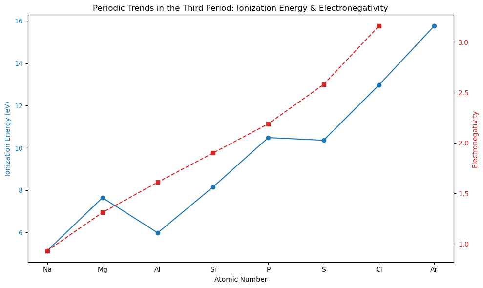
Lets start by making a list of the elements in the third period of the atomic table
third_period_atomic_numbers = list(range(11, 19))  # Na (11) to Ar (18)
print(third_period_atomic_numbers)
[11, 12, 13, 14, 15, 16, 17, 18]
Now lets convert their atomic numbers to the symbols, which is what the dataframe above uses for row labels
# Filter for third-period elements
third_period_df = df_periodictable[df_periodictable['AtomicNumber'].isin(third_period_atomic_numbers)]

# Sort by AtomicNumber for correct x-axis order
third_period_df = third_period_df.sort_values('AtomicNumber')

# Extract values for plotting
atomic_numbers = third_period_df['AtomicNumber'].values
ionization_energies = third_period_df['IonizationEnergy'].values
electronegativities = third_period_df['Electronegativity'].values
symbols = third_period_df.index.values  # This will be element symbols
print(f"atomic_numbers: {atomic_numbers} \n ionization energies: {ionization_energies} \n electronegativities: {electronegativities} \n symbols: {symbols}")
atomic_numbers: [11 12 13 14 15 16 17 18]
 ionization energies: [ 5.139  7.646  5.986  8.152 10.487 10.36  12.968 15.76 ]
 electronegativities: [0.93 1.31 1.61 1.9  2.19 2.58 3.16  nan]
 symbols: ['Na' 'Mg' 'Al' 'Si' 'P' 'S' 'Cl' 'Ar']
import matplotlib.pyplot as plt

fig, ax1 = plt.subplots(figsize=(10, 6))

# Left y-axis: Ionization Energy
color1 = 'tab:blue'
ax1.set_xlabel('Atomic Number')
ax1.set_ylabel('Ionization Energy (eV)', color=color1)
ax1.plot(atomic_numbers, ionization_energies, marker='o', color=color1, label='Ionization Energy')
ax1.tick_params(axis='y', labelcolor=color1)

# X-ticks as element symbols
ax1.set_xticks(atomic_numbers)
ax1.set_xticklabels(symbols)

# Right y-axis: Electronegativity
ax2 = ax1.twinx()
color2 = 'tab:red'
ax2.set_ylabel('Electronegativity', color=color2)
ax2.plot(atomic_numbers, electronegativities, marker='s', linestyle='--', color=color2, label='Electronegativity')
ax2.tick_params(axis='y', labelcolor=color2)

# Title and layout
plt.title('Periodic Trends in the Third Period: Ionization Energy & Electronegativity')
fig.tight_layout()
plt.show()
`
In Class activity#
alter the above code to work for the second row of the periodic table
Alter the above code to show the trends of atomic radius and atomic mass as you go across the fourth period
Periodic trend of electronegativity
import numpy as np
import matplotlib.pyplot as plt

# Sort by Atomic Number to maintain order
df_sorted = df_periodictable.sort_values('AtomicNumber')

# Extract data
atomic_numbers = df_sorted['AtomicNumber'].values
ionization_energies = df_sorted['IonizationEnergy'].values
electronegativities = df_sorted['Electronegativity'].values
symbols = df_sorted.index.values  # element symbols
print(f"atomic_numbers: {atomic_numbers}\n ionization energies: {ionization_energies}  \n symbols: {symbols}")
atomic_numbers: [  1   2   3   4   5   6   7   8   9  10  11  12  13  14  15  16  17  18
  19  20  21  22  23  24  25  26  27  28  29  30  31  32  33  34  35  36
  37  38  39  40  41  42  43  44  45  46  47  48  49  50  51  52  53  54
  55  56  57  58  59  60  61  62  63  64  65  66  67  68  69  70  71  72
  73  74  75  76  77  78  79  80  81  82  83  84  85  86  87  88  89  90
  91  92  93  94  95  96  97  98  99 100 101 102 103 104 105 106 107 108
 109 110 111 112 113 114 115 116 117 118]
 ionization energies: [13.598 24.587  5.392  9.323  8.298 11.26  14.534 13.618 17.423 21.565
  5.139  7.646  5.986  8.152 10.487 10.36  12.968 15.76   4.341  6.113
  6.561  6.828  6.746  6.767  7.434  7.902  7.881  7.64   7.726  9.394
  5.999  7.9    9.815  9.752 11.814 14.     4.177  5.695  6.217  6.634
  6.759  7.092  7.28   7.361  7.459  8.337  7.576  8.994  5.786  7.344
  8.64   9.01  10.451 12.13   3.894  5.212  5.577  5.539  5.464  5.525
  5.55   5.644  5.67   6.15   5.864  5.939  6.022  6.108  6.184  6.254
  5.426  6.825  7.89   7.98   7.88   8.7    9.1    9.     9.226 10.438
  6.108  7.417  7.289  8.417  9.5   10.745  3.9    5.279  5.17   6.08
  5.89   6.194  6.266  6.06   5.993  6.02   6.23   6.3    6.42   6.5
  6.58   6.65     nan    nan    nan    nan    nan    nan    nan    nan
    nan    nan    nan    nan    nan    nan    nan    nan]
 symbols: ['H' 'He' 'Li' 'Be' 'B' 'C' 'N' 'O' 'F' 'Ne' 'Na' 'Mg' 'Al' 'Si' 'P' 'S'
 'Cl' 'Ar' 'K' 'Ca' 'Sc' 'Ti' 'V' 'Cr' 'Mn' 'Fe' 'Co' 'Ni' 'Cu' 'Zn' 'Ga'
 'Ge' 'As' 'Se' 'Br' 'Kr' 'Rb' 'Sr' 'Y' 'Zr' 'Nb' 'Mo' 'Tc' 'Ru' 'Rh' 'Pd'
 'Ag' 'Cd' 'In' 'Sn' 'Sb' 'Te' 'I' 'Xe' 'Cs' 'Ba' 'La' 'Ce' 'Pr' 'Nd' 'Pm'
 'Sm' 'Eu' 'Gd' 'Tb' 'Dy' 'Ho' 'Er' 'Tm' 'Yb' 'Lu' 'Hf' 'Ta' 'W' 'Re' 'Os'
 'Ir' 'Pt' 'Au' 'Hg' 'Tl' 'Pb' 'Bi' 'Po' 'At' 'Rn' 'Fr' 'Ra' 'Ac' 'Th'
 'Pa' 'U' 'Np' 'Pu' 'Am' 'Cm' 'Bk' 'Cf' 'Es' 'Fm' 'Md' 'No' 'Lr' 'Rf' 'Db'
 'Sg' 'Bh' 'Hs' 'Mt' 'Ds' 'Rg' 'Cn' 'Nh' 'Fl' 'Mc' 'Lv' 'Ts' 'Og']
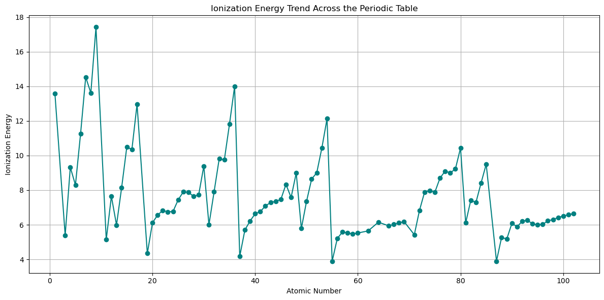
# Mask valid (non-NaN) entries
valid_mask = ~np.isnan(electronegativities)

fig, ax = plt.subplots(figsize=(12, 6))
ax.plot(atomic_numbers[valid_mask], ionization_energies[valid_mask],
        marker='o', linestyle='-', color='teal')

ax.set_title('Ionization Energy Trend Across the Periodic Table')
ax.set_xlabel('Atomic Number')
ax.set_ylabel('Ionization Energy')
ax.grid(True)

plt.tight_layout()
plt.show()
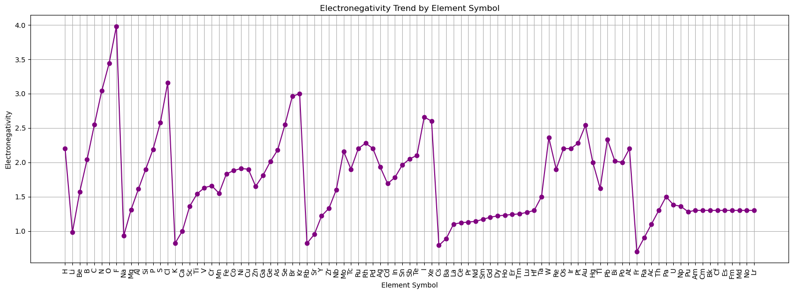
# For categorical x-axis, skip NaN values and align arrays
valid_indices = np.where(valid_mask)[0]
valid_symbols = symbols[valid_mask]
valid_en = electronegativities[valid_mask]

fig, ax = plt.subplots(figsize=(16, 6))
ax.plot(valid_symbols, valid_en, marker='o', linestyle='-', color='purple')

ax.set_title('Electronegativity Trend by Element Symbol')
ax.set_xlabel('Element Symbol')
ax.set_ylabel('Electronegativity')
ax.grid(True)

# Rotate x-tick labels for readability
plt.xticks(rotation=90)

plt.tight_layout()
plt.show()
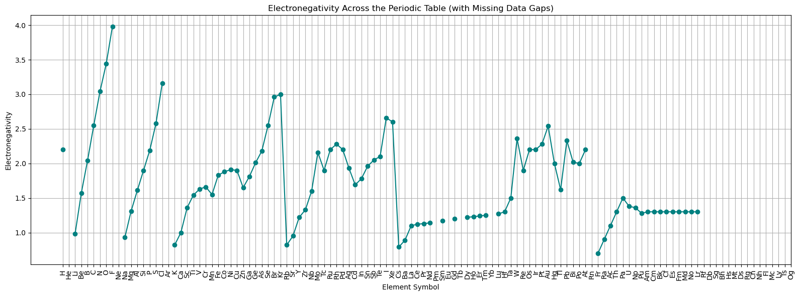
import numpy as np
import matplotlib.pyplot as plt

# Sort by AtomicNumber
df_sorted = df_periodictable.sort_values('AtomicNumber')

# Get all atomic numbers and symbols (x-axis)
atomic_numbers = df_sorted['AtomicNumber'].values
symbols = df_sorted.index.values  # element symbols as index

# Prepare Electronegativity data (with NaNs for missing values)
electronegativity = df_sorted['Electronegativity'].values

# Now plot with NaNs preserved
fig, ax = plt.subplots(figsize=(16, 6))

# Plot line: breaks at NaNs
ax.plot(atomic_numbers, electronegativity, linestyle='-', marker='o', color='teal')

# Set x-axis ticks and labels
ax.set_xticks(atomic_numbers)
ax.set_xticklabels(symbols, rotation=90)

# Labels and grid
ax.set_title('Electronegativity Across the Periodic Table (with Missing Data Gaps)')
ax.set_xlabel('Element Symbol')
ax.set_ylabel('Electronegativity')
ax.grid(True)

plt.tight_layout()
plt.show()
Histograms vs. Bar Charts#
Feature |
Histogram |
Bar Plot |
|---|---|---|
Data Type |
Continuous/numeric (e.g., mass, radius) |
Categorical (e.g., element groups) |
X-Axis |
Bins/ranges (e.g., 0–50, 50–100) |
Categories (e.g., “Alkali”, “Noble Gas”) |
Bar Width |
No gaps between bars (adjacent bins) |
Gaps between bars (separate categories) |
Purpose |
Shows distribution of values |
Compares quantities between groups/categories |
Example |
Distribution of Atomic Radius values |
Number of elements in each GroupBlock |
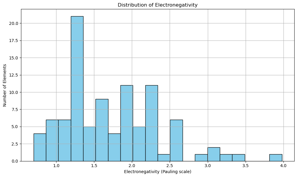
Are most elements electronegative or electropositive?#
import matplotlib.pyplot as plt

# Drop NaN values to avoid errors in plotting
atomic_masses = df_periodictable['Electronegativity'].dropna()

fig, ax = plt.subplots(figsize=(10, 6))
ax.hist(atomic_masses, bins=20, color='skyblue', edgecolor='black')
ax.set_title('Distribution of Electronegativity')
ax.set_xlabel('Electronegativity (Pauling scale)')
ax.set_ylabel('Number of Elements')
plt.grid(True)
plt.tight_layout()
plt.show()
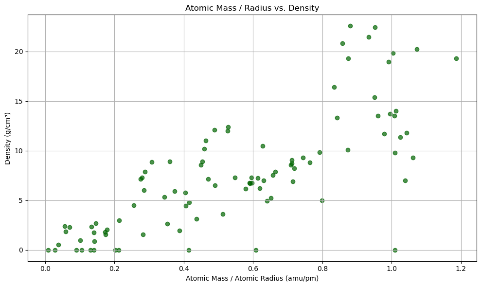
import matplotlib.pyplot as plt
import numpy as np

# Clean data: drop rows where any of the required values are missing
subset_df = df_periodictable[['AtomicMass', 'AtomicRadius', 'Density']].dropna()

# Compute mass/radius
mass_per_radius = subset_df['AtomicMass'] / subset_df['AtomicRadius']
density = subset_df['Density']

# Scatter plot
fig, ax = plt.subplots(figsize=(10, 6))
scatter = ax.scatter(mass_per_radius, density, color='darkgreen', alpha=0.7)

ax.set_title('Atomic Mass / Radius vs. Density')
ax.set_xlabel('Atomic Mass / Atomic Radius (amu/pm)')
ax.set_ylabel('Density (g/cm³)')
ax.grid(True)

plt.tight_layout()
plt.show()
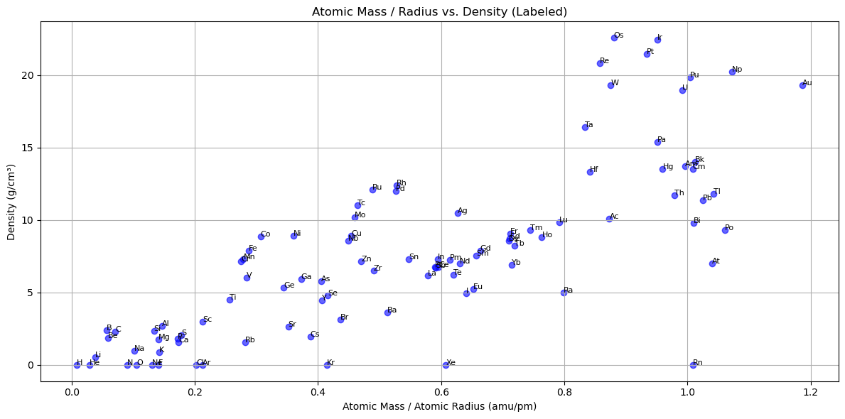
# Get element symbols from index
symbols = subset_df.index

fig, ax = plt.subplots(figsize=(12, 6))
for i in range(len(symbols)):
    ax.scatter(mass_per_radius.iloc[i], density.iloc[i], color='blue', alpha=0.6)
    ax.text(mass_per_radius.iloc[i], density.iloc[i], symbols[i], fontsize=8)

ax.set_title('Atomic Mass / Radius vs. Density (Labeled)')
ax.set_xlabel('Atomic Mass / Atomic Radius (amu/pm)')
ax.set_ylabel('Density (g/cm³)')
ax.grid(True)
plt.tight_layout()
plt.show()
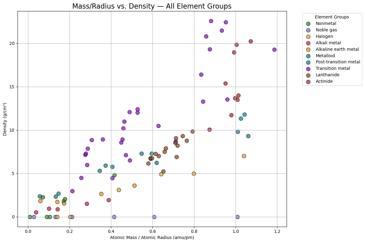
import matplotlib.pyplot as plt

# Define a color for each GroupBlock
group_colors = {
    'Nonmetal': 'forestgreen',
    'Noble gas': 'mediumslateblue',
    'Halogen': 'goldenrod',
    'Alkali metal': 'crimson',
    'Alkaline earth metal': 'darkorange',
    'Metalloid': 'teal',
    'Post-transition metal': 'darkcyan',
    'Transition metal': 'darkviolet',
    'Lanthanide': 'saddlebrown',
    'Actinide': 'firebrick'
}

# Create a scatterplot for all elements, color-coded by group
plt.figure(figsize=(12, 8))

for group, color in group_colors.items():
    group_df = df_periodictable[df_periodictable['GroupBlock'] == group]

    # Drop rows with NaNs
    clean_df = group_df.dropna(subset=['AtomicMass', 'AtomicRadius', 'Density'])

    if clean_df.empty:
        continue  # Skip group if no valid data

    mass_per_radius = clean_df['AtomicMass'] / clean_df['AtomicRadius']
    density = clean_df['Density']

    # Scatter plot for group
    plt.scatter(mass_per_radius, density,
                color=color, edgecolor='black', s=80, alpha=0.7, label=group)

# Labels and legend
plt.title('Mass/Radius vs. Density — All Element Groups', fontsize=16)
plt.xlabel('Atomic Mass / Atomic Radius (amu/pm)')
plt.ylabel('Density (g/cm³)')
plt.grid(True)
plt.legend(title='Element Groups', bbox_to_anchor=(1.05, 1), loc='upper left')
plt.tight_layout()
plt.show()
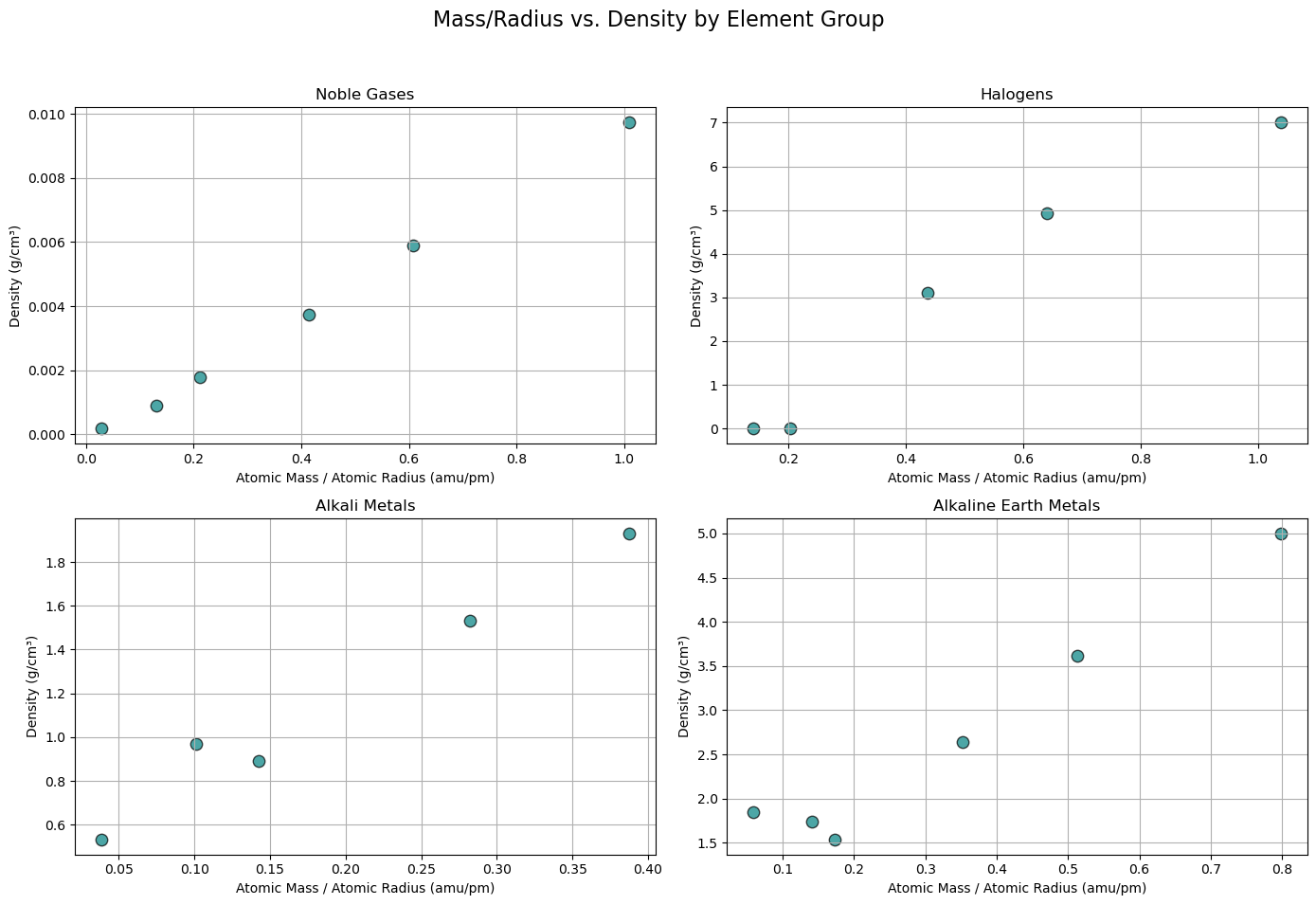
import matplotlib.pyplot as plt

# Updated groups list with correct labels (matching your DataFrame exactly)
groups = [
    ('Noble gas', 'Noble Gases'),
    ('Halogen', 'Halogens'),
    ('Alkali metal', 'Alkali Metals'),
    ('Alkaline earth metal', 'Alkaline Earth Metals')
]

# Set up 2x2 subplot grid
fig, axes = plt.subplots(2, 2, figsize=(14, 10))
axes = axes.flatten()

for i, (group_block, title) in enumerate(groups):
    ax = axes[i]

    # Filter DataFrame for this group
    group_df = df_periodictable[df_periodictable['GroupBlock'] == group_block]

    # Drop rows with NaNs in key columns
    clean_df = group_df.dropna(subset=['AtomicMass', 'AtomicRadius', 'Density'])

    # Debug: Show count before and after dropna
    print(f"{title}: {len(group_df)} total rows, {len(clean_df)} valid rows after dropna")

    if clean_df.empty:
        ax.set_title(f"{title} (No Data)")
        ax.axis('off')
        continue

    # Compute Mass/Radius
    mass_per_radius = clean_df['AtomicMass'] / clean_df['AtomicRadius']
    density = clean_df['Density']

    # Scatter plot
    ax.scatter(mass_per_radius, density, color='teal', edgecolor='black', s=80, alpha=0.7)

    # Labels and grid
    ax.set_title(title)
    ax.set_xlabel('Atomic Mass / Atomic Radius (amu/pm)')
    ax.set_ylabel('Density (g/cm³)')
    ax.grid(True)

# Main title and layout adjustment
plt.suptitle('Mass/Radius vs. Density by Element Group', fontsize=16)
plt.tight_layout(rect=[0, 0.03, 1, 0.95])
plt.show()
Noble Gases: 7 total rows, 6 valid rows after dropna
Halogens: 6 total rows, 5 valid rows after dropna
Alkali Metals: 6 total rows, 5 valid rows after dropna
Alkaline Earth Metals: 6 total rows, 6 valid rows after dropna
print(df_periodictable['GroupBlock'].unique())
['Nonmetal' 'Noble gas' 'Alkali metal' 'Alkaline earth metal' 'Metalloid'
 'Halogen' 'Post-transition metal' 'Transition metal' 'Lanthanide'
 'Actinide']
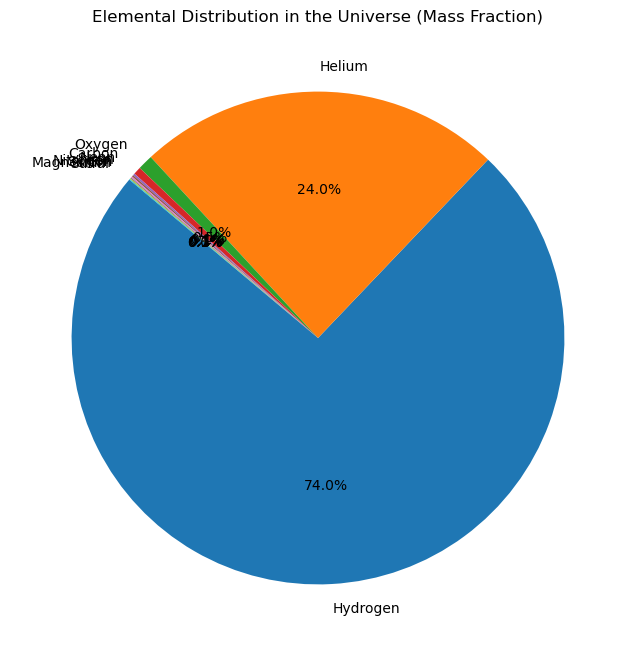
import matplotlib.pyplot as plt

# Data for the pie chart
labels = ['Hydrogen', 'Helium', 'Oxygen', 'Carbon', 'Neon', 'Iron', 'Nitrogen', 'Silicon', 'Magnesium', 'Sulfur']
sizes = [74, 24, 1, 0.5, 0.13, 0.11, 0.09, 0.07, 0.06, 0.05]  # Percentages

# Create the pie chart
plt.figure(figsize=(8, 8))
plt.pie(sizes, labels=labels, autopct='%1.1f%%', startangle=140)
plt.title('Elemental Distribution in the Universe (Mass Fraction)')
plt.show()
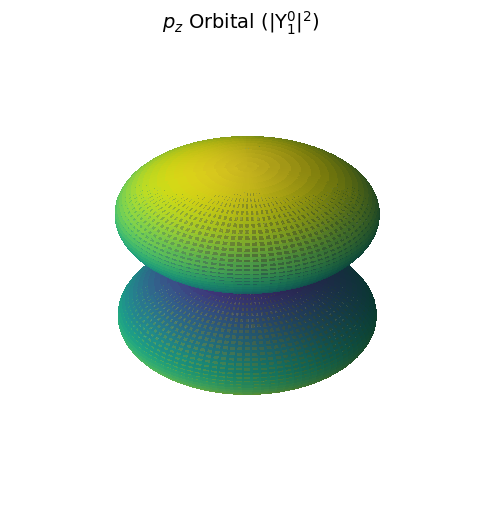
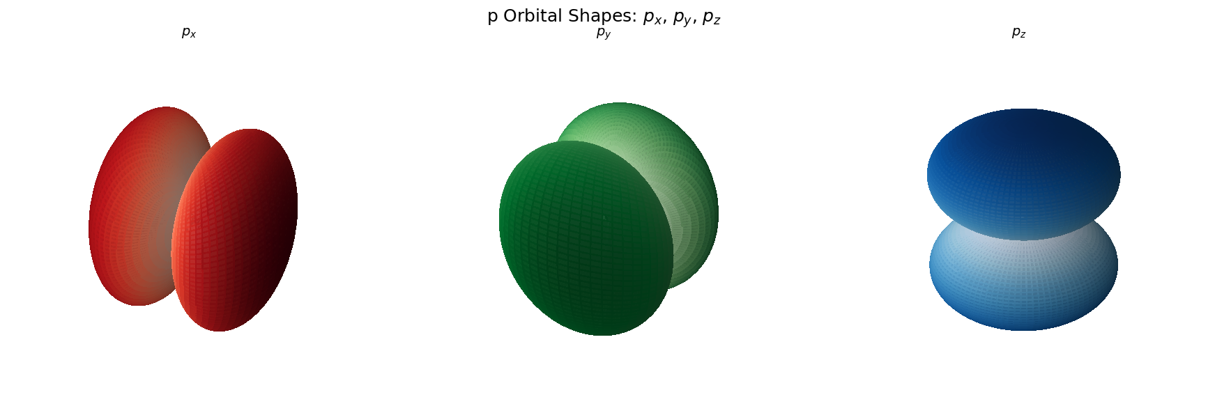
P Orbitals#
import numpy as np
import matplotlib.pyplot as plt
from scipy.special import sph_harm
import warnings

# Suppress the deprecation warning for now
warnings.filterwarnings("ignore", category=DeprecationWarning)

# Spherical coordinates
theta = np.linspace(0, np.pi, 100)
phi = np.linspace(0, 2 * np.pi, 100)
theta, phi = np.meshgrid(theta, phi)

# Quantum numbers
l = 1
m = 0

# Spherical harmonic (working version)
Y_lm = sph_harm(m, l, phi, theta)
prob_density = np.abs(Y_lm)**2

# Cartesian conversion
r = prob_density
x = r * np.sin(theta) * np.cos(phi)
y = r * np.sin(theta) * np.sin(phi)
z = r * np.cos(theta)

# Plot
fig = plt.figure(figsize=(8, 6))
ax = fig.add_subplot(111, projection='3d')
ax.plot_surface(x, y, z, facecolors=plt.cm.viridis(prob_density / prob_density.max()),
                rstride=1, cstride=1, antialiased=False, alpha=0.7)

ax.set_title(r'$p_z$ Orbital (|Y$_1^0|^2$)', fontsize=14)
ax.set_axis_off()
plt.show()
import numpy as np
import matplotlib.pyplot as plt
from scipy.special import sph_harm
import warnings

# Suppress deprecation warning for sph_harm
warnings.filterwarnings("ignore", category=DeprecationWarning)

# Create spherical grid
theta = np.linspace(0, np.pi, 100)
phi = np.linspace(0, 2 * np.pi, 100)
theta, phi = np.meshgrid(theta, phi)

# Create figure with 1 row, 3 subplots (3D)
fig = plt.figure(figsize=(18, 6))

# Orbital definitions (label, m, color map)
orbitals = [
    (r'$p_x$', 1, 'Reds'),
    (r'$p_y$', -1, 'Greens'),
    (r'$p_z$', 0, 'Blues')
]

# Loop through orbitals and plot
for i, (label, m, cmap) in enumerate(orbitals, 1):
    # Compute spherical harmonic
    Y_lm = sph_harm(m, 1, phi, theta)

    # Real combinations for p_x and p_y
    if m == 1:
        Y_real = np.real(Y_lm - sph_harm(-1, 1, phi, theta)) / np.sqrt(2)
    elif m == -1:
        Y_real = np.imag(sph_harm(-1, 1, phi, theta) + Y_lm) / np.sqrt(2)
    else:
        Y_real = np.real(Y_lm)

    prob_density = np.abs(Y_real)
    r = prob_density  # Use |Y| directly for shape
    x = r * np.sin(theta) * np.cos(phi)
    y = r * np.sin(theta) * np.sin(phi)
    z = r * np.cos(theta)

    # Normalize for color mapping
    norm = (r - r.min()) / (r.max() - r.min())

    # Create subplot
    ax = fig.add_subplot(1, 3, i, projection='3d')
    ax.plot_surface(x, y, z, facecolors=plt.cm.get_cmap(cmap)(norm),
                    rstride=1, cstride=1, antialiased=False, alpha=0.9)
    ax.set_title(label, fontsize=14)
    ax.set_box_aspect([1, 1, 1])
    ax.set_axis_off()

# Show entire figure
plt.suptitle("p Orbital Shapes: $p_x$, $p_y$, $p_z$", fontsize=18)
plt.tight_layout()
plt.show()
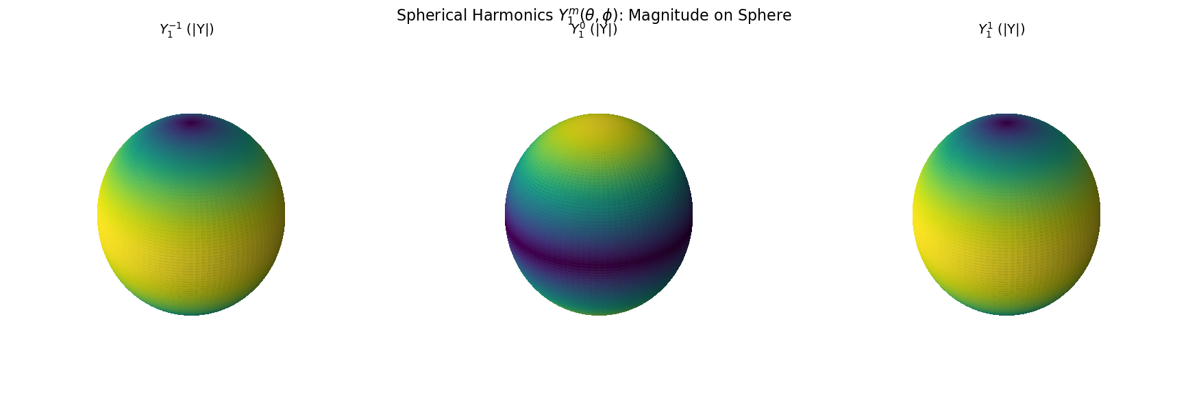
import numpy as np
import matplotlib.pyplot as plt
from scipy.special import sph_harm
import warnings

# Suppress deprecation warning
warnings.filterwarnings("ignore", category=DeprecationWarning)

# Spherical grid
theta = np.linspace(0, np.pi, 100)
phi = np.linspace(0, 2 * np.pi, 100)
theta, phi = np.meshgrid(theta, phi)

# Cartesian coords for sphere surface
x = np.sin(theta) * np.cos(phi)
y = np.sin(theta) * np.sin(phi)
z = np.cos(theta)

# Quantum numbers
l = 1
m_values = [-1, 0, 1]
titles = [r'$Y_1^{-1}$', r'$Y_1^{0}$', r'$Y_1^{1}$']

# Create figure
fig = plt.figure(figsize=(18, 6))

for i, m in enumerate(m_values):
    Y_lm = sph_harm(m, l, phi, theta)
    magnitude = np.abs(Y_lm)  # Change to .real or .imag to explore those

    # Normalize for colormap
    mag_norm = (magnitude - magnitude.min()) / (magnitude.max() - magnitude.min())

    # Plot on sphere
    ax = fig.add_subplot(1, 3, i+1, projection='3d')
    ax.plot_surface(x, y, z, facecolors=plt.cm.viridis(mag_norm),
                    rstride=1, cstride=1, antialiased=False, alpha=0.9)
    ax.set_title(f"{titles[i]} (|Y|)", fontsize=14)
    ax.set_box_aspect([1, 1, 1])
    ax.set_axis_off()

plt.suptitle(r"Spherical Harmonics $Y_1^m(\theta, \phi)$: Magnitude on Sphere", fontsize=16)
plt.tight_layout()
plt.show()
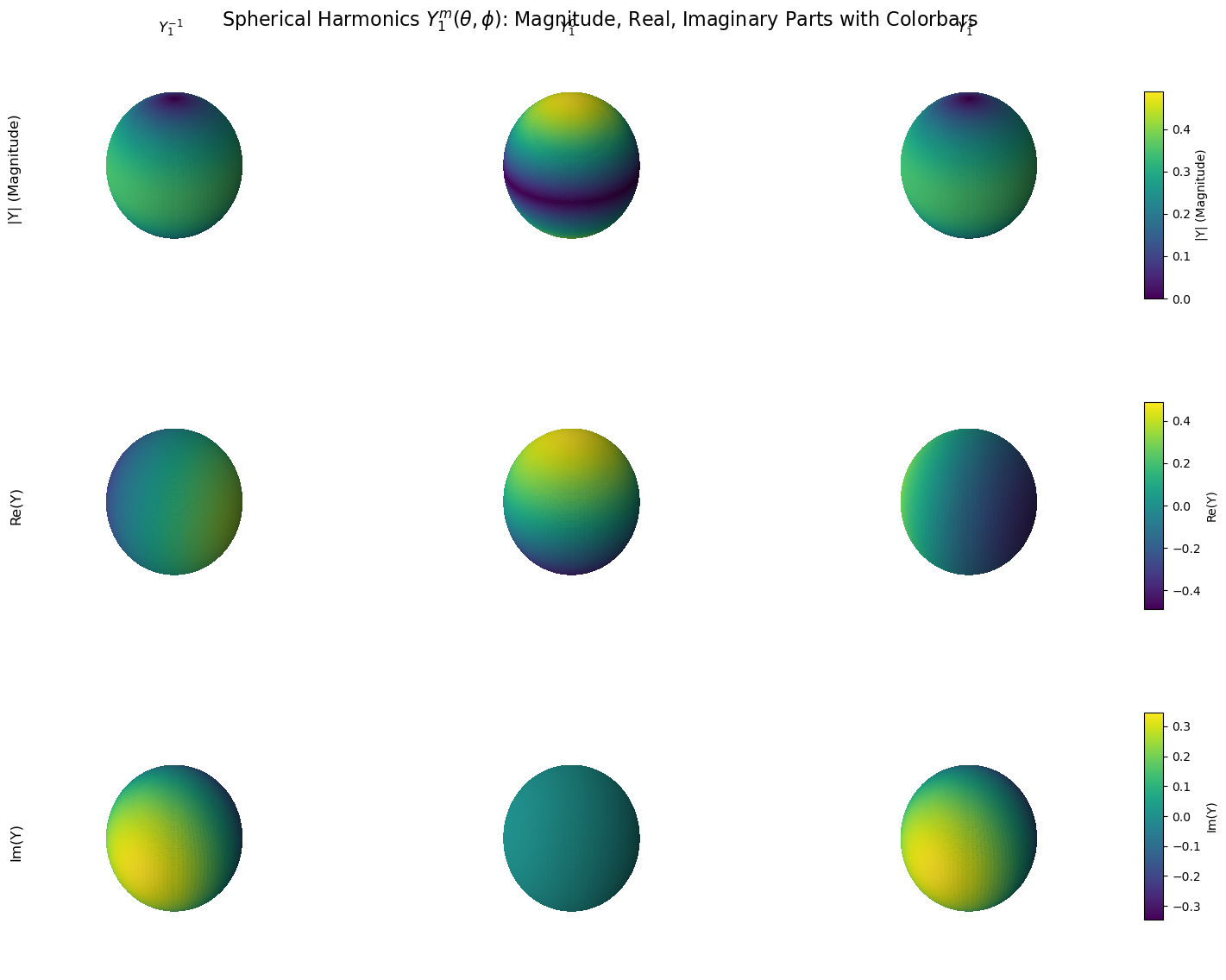
import numpy as np
import matplotlib.pyplot as plt
from scipy.special import sph_harm
import warnings

# Suppress deprecation warning for sph_harm
warnings.filterwarnings("ignore", category=DeprecationWarning)

# Spherical grid
theta = np.linspace(0, np.pi, 100)
phi = np.linspace(0, 2 * np.pi, 100)
theta, phi = np.meshgrid(theta, phi)

# Cartesian coordinates for unit sphere
x = np.sin(theta) * np.cos(phi)
y = np.sin(theta) * np.sin(phi)
z = np.cos(theta)

# Quantum numbers
l = 1
m_values = [-1, 0, 1]
col_titles = [r'$Y_1^{-1}$', r'$Y_1^{0}$', r'$Y_1^{1}$']
row_titles = ['|Y| (Magnitude)', 'Re(Y)', 'Im(Y)']

# Create figure
fig = plt.figure(figsize=(15, 12))
cmap = plt.cm.viridis  # Consistent colormap

# Data fields to loop over
data_types = ['magnitude', 'real', 'imag']

# For colorbars
colorbars = []

for i, data_label in enumerate(data_types):
    all_fields = []  # Collect all values in row for colorbar range

    # First pass: collect data for normalization range
    for m in m_values:
        Y_lm = sph_harm(m, l, phi, theta)
        if data_label == 'magnitude':
            field = np.abs(Y_lm)
        elif data_label == 'real':
            field = Y_lm.real
        elif data_label == 'imag':
            field = Y_lm.imag
        all_fields.append(field)

    # Determine global min/max for the row
    combined = np.concatenate([f.flatten() for f in all_fields])
    global_min, global_max = combined.min(), combined.max()

    # Avoid divide by zero
    if np.isclose(global_max, global_min):
        global_max = global_min + 1e-8

    # Second pass: plot with consistent normalization
    for j, field in enumerate(all_fields):
        norm = (field - global_min) / (global_max - global_min)

        ax = fig.add_subplot(3, 3, i * 3 + j + 1, projection='3d')
        surf = ax.plot_surface(x, y, z, facecolors=cmap(norm),
                               rstride=1, cstride=1, antialiased=False, alpha=0.9)
        ax.set_box_aspect([1, 1, 1])
        ax.set_axis_off()

        if i == 0:
            ax.set_title(col_titles[j], fontsize=12)
        if j == 0:
            ax.text2D(-0.1, 0.5, row_titles[i], fontsize=12, rotation=90,
                      transform=ax.transAxes, va='center', ha='center')

    # Add shared colorbar for the row
    cbar_ax = fig.add_axes([0.92, 0.7 - i * 0.3, 0.015, 0.2])  # Position on the right
    sm = plt.cm.ScalarMappable(cmap=cmap)
    sm.set_array(combined)
    sm.set_clim(global_min, global_max)
    cbar = fig.colorbar(sm, cax=cbar_ax)
    cbar.set_label(row_titles[i], fontsize=10)

plt.suptitle("Spherical Harmonics $Y_1^m(\\theta, \\phi)$: Magnitude, Real, Imaginary Parts with Colorbars", fontsize=16)
plt.subplots_adjust(left=0.05, right=0.9, top=0.95, bottom=0.05, wspace=0.3, hspace=0.3)

plt.show()
Acknowldegments#
Material in this activty has been adapted from chapter 3 of Charles Weiss’s book “Scientific Computing for Chemists with Python”, CC BY-NC-SA 4.0.
Additional content was developed with assistance from Perplexity AI and Chat GPT. Multiple queries were made during the Fall 2024 and the Spring 2025.