7. Seaborn Part 3#
3. Seaborn Plots (cont)#
3.4 Regression Plots#
Regression Plot (sns.regplot())#
Plots scatter points of your data.
Overlays a linear regression line (by default).
Uses NumPy and SciPy internally to calculate the least squares best fit line. $\( y = mx + b \)$
Where:
m is the slope.
b is the intercept.
It finds the line that minimizes the squared vertical distances (errors) from the data points to the line: $\( \min \sum (y_i - (mx_i + b))^2 \)$
Seaborn Option |
Method Used |
Function Called |
|---|---|---|
|
Linear regression |
|
|
Polynomial regression |
|
|
Locally weighted smoothing |
|
lowess = LOcally WEighted Scatterplot Smoothing
Parameter |
Type |
Description |
|---|---|---|
|
str or array |
Variable for x-axis |
|
str or array |
Variable for y-axis |
|
DataFrame |
Data source containing |
|
bool |
Whether to draw the regression line ( |
|
int or None |
Size of confidence interval in percent (default=95). Use |
|
int |
Number of bootstrap samples to estimate |
|
dict |
Keyword args for customizing the regression line (e.g., color, linewidth) |
|
dict |
Keyword args for customizing the scatterplot (e.g., s=size, alpha) |
|
int |
Degree of polynomial regression (1 = linear) |
|
bool |
Set |
|
float |
Add jitter to x-values to reduce overlap |
|
float |
Add jitter to y-values |
|
bool |
Whether to truncate the regression line to data range |
|
bool |
Whether to ignore missing values |
|
bool |
Fit a nonparametric LOWESS regression curve |
|
str |
Color for both points and line |
|
matplotlib.axes |
Existing axis to draw the plot on |
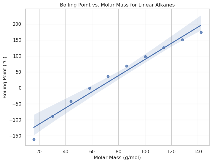
import pandas as pd

alkanes = pd.DataFrame({
    "Alkane": ["Methane", "Ethane", "Propane", "Butane", "Pentane",
               "Hexane", "Heptane", "Octane", "Nonane", "Decane"],
    "Carbons": list(range(1, 11)),
    "MolarMass": [16.04, 30.07, 44.10, 58.12, 72.15,
                  86.18, 100.21, 114.23, 128.26, 142.29],
    "BoilingPoint": [-161.5, -88.6, -42.1, -0.5, 36.1,
                     68.7, 98.4, 125.6, 150.8, 174.1]
})

import seaborn as sns
import matplotlib.pyplot as plt

sns.set(style="whitegrid")

# Regression plot: Boiling Point vs. Molar Mass
plt.figure(figsize=(8, 6))
sns.regplot(data=alkanes, x="MolarMass", y="BoilingPoint")

plt.title("Boiling Point vs. Molar Mass for Linear Alkanes")
plt.xlabel("Molar Mass (g/mol)")
plt.ylabel("Boiling Point (°C)")
plt.show()
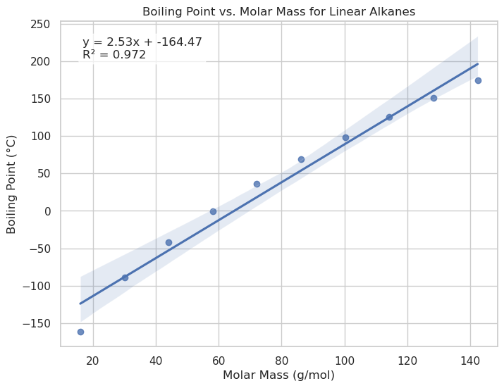
from scipy.stats import linregress

# Extract x and y data from your DataFrame
x = alkanes["MolarMass"]
y = alkanes["BoilingPoint"]

# Perform linear regression
slope, intercept, r_value, p_value, std_err = linregress(x, y)

# Print slope and intercept
print(f"Slope: {slope:.3f}")
print(f"Intercept: {intercept:.3f}")
print(f"R²: {r_value**2:.3f}")
print(f"p value: {p_value**2:.3f}, if p value <0.05 slope is statistically significant")
print(f"std_err: {std_err**2:.3f}, (smaller the better)")
Slope: 2.534
Intercept: -164.469
R²: 0.972
p value: 0.000, if p value <0.05 slope is statistically significant
std_err: 0.023, (smaller the better)
import seaborn as sns
import matplotlib.pyplot as plt

# Create the plot
plt.figure(figsize=(8, 6))
ax = sns.regplot(x=x, y=y)

# Annotate with equation
equation = f"y = {slope:.2f}x + {intercept:.2f}\nR² = {r_value**2:.3f}"
ax.text(0.05, 0.95, equation, transform=ax.transAxes,
        fontsize=12, verticalalignment='top', bbox=dict(boxstyle="round", facecolor="white", alpha=0.7))

# Labels
ax.set_title("Boiling Point vs. Molar Mass for Linear Alkanes")
ax.set_xlabel("Molar Mass (g/mol)")
ax.set_ylabel("Boiling Point (°C)")

plt.show()
Logistics Regression (sns.lmplot())#
Carbon Atoms |
Alkane |
Molar Mass (g/mol) |
Boiling Point (°C) |
Alcohol |
Molar Mass (g/mol) |
Boiling Point (°C) |
|---|---|---|---|---|---|---|
1 |
Methane |
16.04 |
-161.5 |
Methanol |
32.04 |
64.7 |
2 |
Ethane |
30.07 |
-88.6 |
Ethanol |
46.07 |
78.4 |
3 |
Propane |
44.10 |
-42.1 |
1-Propanol |
60.10 |
97.0 |
4 |
Butane |
58.12 |
-0.5 |
1-Butanol |
74.12 |
117.7 |
5 |
Pentane |
72.15 |
36.1 |
1-Pentanol |
88.15 |
137.9 |
6 |
Hexane |
86.18 |
68.7 |
1-Hexanol |
102.18 |
157.5 |
7 |
Heptane |
100.21 |
98.4 |
1-Heptanol |
116.21 |
176.9 |
8 |
Octane |
114.23 |
125.7 |
1-Octanol |
130.23 |
195.0 |
9 |
Nonane |
128.26 |
150.8 |
1-Nonanol |
144.26 |
212.6 |
10 |
Decane |
142.29 |
174.0 |
1-Decanol |
158.29 |
229.7 |
import pandas as pd
import seaborn as sns
import matplotlib.pyplot as plt

# Data preparation
data = {
    'CarbonAtoms': list(range(1, 11)) * 2,
    'MolarMass': [16.04, 30.07, 44.10, 58.12, 72.15, 86.18, 100.21, 114.23, 128.26, 142.29,
                  32.04, 46.07, 60.10, 74.12, 88.15, 102.18, 116.21, 130.23, 144.26, 158.29],
    'BoilingPoint': [-161.5, -88.6, -42.1, -0.5, 36.1, 68.7, 98.4, 125.7, 150.8, 174.0,
                     64.7, 78.4, 97.0, 117.7, 137.9, 157.5, 176.9, 195.0, 212.6, 229.7],
    'CompoundType': ['Alkane'] * 10 + ['Alcohol'] * 10
}

df = pd.DataFrame(data)

# Plotting
sns.set_theme(style="whitegrid")
g = sns.lmplot(
    data=df,
    x='MolarMass',
    y='BoilingPoint',
    hue='CompoundType',
    height=6,
    aspect=1.5,
    markers=['o', 's'],
    palette='muted',
    ci=None
)

# Titles and labels
g.set_axis_labels('Molar Mass (g/mol)', 'Boiling Point (°C)')
g.fig.suptitle('Boiling Point vs. Molar Mass for Alkanes and Primary Alcohols', fontsize=16)
plt.subplots_adjust(top=0.9)

# Show plot
plt.show()
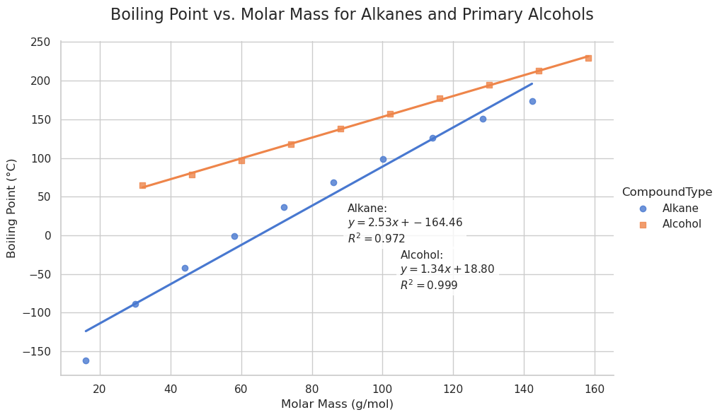
import pandas as pd
import seaborn as sns
import matplotlib.pyplot as plt
from scipy.stats import linregress

# Prepare the data
data = {
    'CarbonAtoms': list(range(1, 11)) * 2,
    'MolarMass': [16.04, 30.07, 44.10, 58.12, 72.15, 86.18, 100.21, 114.23, 128.26, 142.29,
                  32.04, 46.07, 60.10, 74.12, 88.15, 102.18, 116.21, 130.23, 144.26, 158.29],
    'BoilingPoint': [-161.5, -88.6, -42.1, -0.5, 36.1, 68.7, 98.4, 125.7, 150.8, 174.0,
                     64.7, 78.4, 97.0, 117.7, 137.9, 157.5, 176.9, 195.0, 212.6, 229.7],
    'CompoundType': ['Alkane'] * 10 + ['Alcohol'] * 10
}

df = pd.DataFrame(data)

# Perform regression analysis for each compound type
results = {}
for compound in ['Alkane', 'Alcohol']:
    subset = df[df['CompoundType'] == compound]
    slope, intercept, r_value, p_value, std_err = linregress(subset['MolarMass'], subset['BoilingPoint'])
    results[compound] = {
        'slope': slope,
        'intercept': intercept,
        'r_squared': r_value**2
    }

# Create the plot
sns.set_theme(style="whitegrid")
g = sns.lmplot(
    data=df,
    x='MolarMass',
    y='BoilingPoint',
    hue='CompoundType',
    height=6,
    aspect=1.5,
    markers=['o', 's'],
    palette='muted',
    ci=None
)

# Annotate regression equations
ax = g.ax  # Get the Matplotlib Axes object
text_y = {
    'Alkane': -10,
    'Alcohol': -70
}
for compound, res in results.items():
    label = f"{compound}:\n$y = {res['slope']:.2f}x + {res['intercept']:.2f}$\n$R^2 = {res['r_squared']:.3f}$"
    x_pos = 90 if compound == "Alkane" else 105
    ax.text(x_pos, text_y[compound], label, fontsize=11, bbox=dict(boxstyle="round", facecolor="white", alpha=0.8))

# Final plot tweaks
g.set_axis_labels('Molar Mass (g/mol)', 'Boiling Point (°C)')
g.fig.suptitle('Boiling Point vs. Molar Mass for Alkanes and Primary Alcohols', fontsize=16)
plt.subplots_adjust(top=0.9)
plt.show()
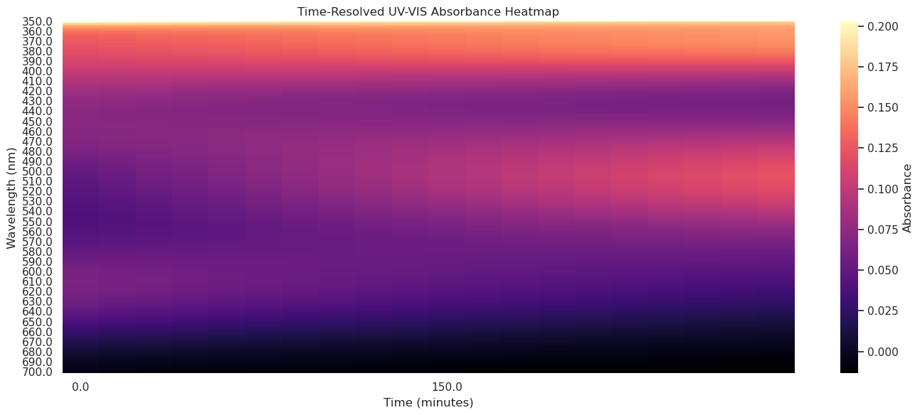
3.5 Heatmaps/grids#
Heatmaps#
import pandas as pd
import seaborn as sns
import matplotlib.pyplot as plt
import os

# Set path to your aquation.csv file
aquation_csv_datapath = os.path.expanduser("~/data/spectra/aquation.csv")

# Step 1: Load the CSV
df = pd.read_csv(aquation_csv_datapath)

# Step 2: Promote first row to column headers (time values in minutes)
df.columns = df.iloc[0]
df = df.drop(index=0)

# Step 3: Rename first column to "Wavelength" and set it as index
df = df.rename(columns={df.columns[0]: "Wavelength"})
df.set_index("Wavelength", inplace=True)

# Step 4: Convert all values to numeric (in case of any formatting issues)
df = df.apply(pd.to_numeric, errors='coerce')

# Optional: Sort index just in case
df.index = df.index.astype(float)
df = df.sort_index()

# Step 5: Plot the heatmap
plt.figure(figsize=(14, 6))
sns.heatmap(
    df,
    cmap="magma",
    cbar_kws={'label': 'Absorbance'},
    xticklabels=10,  # Show every 10th time point on x-axis
    yticklabels=10   # Show every 10th wavelength on y-axis
)

plt.title("Time-Resolved UV-VIS Absorbance Heatmap")
plt.xlabel("Time (minutes)")
plt.ylabel("Wavelength (nm)")
plt.tight_layout()
plt.show()
import pandas as pd
import seaborn as sns
import matplotlib.pyplot as plt
import numpy as np
import os

# Load PubChem periodic table data
periodictable_csv_datapath = os.path.expanduser("~/data/pubchem_data/PubChemElements_all.csv")
df = pd.read_csv(periodictable_csv_datapath)

# Build periodic table layout (main group + transition elements)
pt_layout = [
    # Period 1
    (1, 1, "H"), (2, 18, "He"),
    # Period 2
    (3, 1, "Li"), (4, 2, "Be"), (5, 13, "B"), (6, 14, "C"), (7, 15, "N"), (8, 16, "O"), (9, 17, "F"), (10, 18, "Ne"),
    # Period 3
    (11, 1, "Na"), (12, 2, "Mg"), (13, 13, "Al"), (14, 14, "Si"), (15, 15, "P"), (16, 16, "S"), (17, 17, "Cl"), (18, 18, "Ar"),
    # Period 4
    (19, 1, "K"), (20, 2, "Ca"), (21, 3, "Sc"), (22, 4, "Ti"), (23, 5, "V"), (24, 6, "Cr"), (25, 7, "Mn"), (26, 8, "Fe"),
    (27, 9, "Co"), (28, 10, "Ni"), (29, 11, "Cu"), (30, 12, "Zn"), (31, 13, "Ga"), (32, 14, "Ge"), (33, 15, "As"),
    (34, 16, "Se"), (35, 17, "Br"), (36, 18, "Kr"),
    # Period 5
    (37, 1, "Rb"), (38, 2, "Sr"), (39, 3, "Y"), (40, 4, "Zr"), (41, 5, "Nb"), (42, 6, "Mo"), (43, 7, "Tc"), (44, 8, "Ru"),
    (45, 9, "Rh"), (46, 10, "Pd"), (47, 11, "Ag"), (48, 12, "Cd"), (49, 13, "In"), (50, 14, "Sn"), (51, 15, "Sb"),
    (52, 16, "Te"), (53, 17, "I"), (54, 18, "Xe"),
    # Period 6 (no lanthanides)
    (55, 1, "Cs"), (56, 2, "Ba"), (72, 4, "Hf"), (73, 5, "Ta"), (74, 6, "W"), (75, 7, "Re"), (76, 8, "Os"),
    (77, 9, "Ir"), (78, 10, "Pt"), (79, 11, "Au"), (80, 12, "Hg"), (81, 13, "Tl"), (82, 14, "Pb"), (83, 15, "Bi"),
    (84, 16, "Po"), (85, 17, "At"), (86, 18, "Rn"),
    # Period 7 (no actinides)
    (87, 1, "Fr"), (88, 2, "Ra"), (104, 4, "Rf"), (105, 5, "Db"), (106, 6, "Sg"), (107, 7, "Bh"), (108, 8, "Hs"),
    (109, 9, "Mt"), (110, 10, "Ds"), (111, 11, "Rg"), (112, 12, "Cn"), (113, 13, "Nh"), (114, 14, "Fl"),
    (115, 15, "Mc"), (116, 16, "Lv"), (117, 17, "Ts"), (118, 18, "Og")
]

# Create layout DataFrame
template_df = pd.DataFrame(pt_layout, columns=["AtomicNumber", "Group", "Symbol"])
template_df["Period"] = 1  # Fill with placeholder

# Assign periods by atomic number range
for i, rng in enumerate([(1, 2), (3, 10), (11, 18), (19, 36), (37, 54), (55, 86), (87, 118)], start=1):
    template_df.loc[(template_df["AtomicNumber"] >= rng[0]) & (template_df["AtomicNumber"] <= rng[1]), "Period"] = i

# Merge with PubChem electronegativity data
merged = pd.merge(template_df, df[["AtomicNumber", "Electronegativity"]], on="AtomicNumber", how="left")

# Create 7x18 grid
heatmap_data = pd.DataFrame(np.nan, index=range(1, 8), columns=range(1, 19))
label_data = pd.DataFrame("", index=range(1, 8), columns=range(1, 19))

# Populate grid with electronegativity and element symbol
for _, row in merged.iterrows():
    period = int(row["Period"])
    group = int(row["Group"])
    heatmap_data.at[period, group] = row["Electronegativity"]
    label_data.at[period, group] = row["Symbol"]

# Plot the heatmap
plt.figure(figsize=(14, 6))
sns.heatmap(
    heatmap_data,
    annot=label_data,
    fmt='',
    cmap="viridis",
    linewidths=0.5,
    linecolor='gray',
    cbar_kws={'label': 'Electronegativity'},
    square=True,
    mask=heatmap_data.isnull()
)

plt.title("Electronegativity Heatmap of the Periodic Table (excluding Lanthanides/Actinides)")
plt.xlabel("Group")
plt.ylabel("Period")
plt.yticks(rotation=0)
plt.show()
Cluster Map#
Cluster maps utilize a dendogram, which is a dichotomous tree
import pandas as pd
import seaborn as sns
import matplotlib.pyplot as plt
from sklearn.preprocessing import StandardScaler

# Step 1: Define simplified chemistry dataset with Xenon replacing Helium
data = {
    "Element": [
        "Li", "Na", "K", "Rb",             # Alkali metals
        "Be", "Mg", "Ca", "Sr",            # Alkaline earth metals
        "F", "Cl", "Br", "I",              # Halogens
        "Ne", "Ar", "Kr", "Xe"             # Noble gases
    ],
    "Group": [
        "Alkali", "Alkali", "Alkali", "Alkali",
        "AlkalineEarth", "AlkalineEarth", "AlkalineEarth", "AlkalineEarth",
        "Halogen", "Halogen", "Halogen", "Halogen",
        "NobleGas", "NobleGas", "NobleGas", "NobleGas"
    ],
    "Valence_s": [
        1, 1, 1, 1,
        2, 2, 2, 2,
        2, 2, 2, 2,
        2, 2, 2, 2
    ],
    "Valence_p": [
        0, 0, 0, 0,
        0, 0, 0, 0,
        5, 5, 5, 5,
        6, 6, 6, 6
    ]
}

# Step 2: Create DataFrame
df = pd.DataFrame(data)
df.set_index("Element", inplace=True)

# Step 3: Extract features and standardize
features = df[["Valence_s", "Valence_p"]]
scaled = StandardScaler().fit_transform(features)
scaled_df = pd.DataFrame(scaled, index=features.index, columns=features.columns)

# Step 4: Create color map for row labels
group_colors = {
    "Alkali": "#d62728",         # red
    "AlkalineEarth": "#1f77b4",  # blue
    "Halogen": "#2ca02c",        # green
    "NobleGas": "#9467bd"        # purple
}
row_colors = df["Group"].map(group_colors)

# Step 5: Create clustermap with row colors
sns.clustermap(
    scaled_df,
    cmap="vlag",
    annot=True,
    figsize=(9, 6),
    linewidths=0.5,
    row_cluster=True,
    col_cluster=False,
    row_colors=row_colors
)

plt.suptitle("Clustermap of Elements by Valence Shell Configuration", y=1.05)
plt.show()
import numpy as np

data = [
    1, 1, 1, 1,
    2, 2, 2, 2,
    2, 2, 2, 2,
    2, 2, 2, 2
]

std_dev = np.std(data)
print("Standard Deviation:", std_dev)
mean = np.mean(data)
print("Mean:", mean)
print(f"z-score for valence_s alkali metal: {(1-mean)/std_dev:.2f}")
print(f"z-score for valence_s all others: {(2-mean)/std_dev:.2f}")
Standard Deviation: 0.4330127018922193
Mean: 1.75
z-score for valence_s alkali metal: -1.73
z-score for valence_s all others: 0.58
Understanding the dendogram#
These are standardized values (z-scores), meaning: $\( z = \frac{x - \text{mean}}{\text{std dev}} \)\( \)\( z = \frac{x - \mu}{\sigma} \)$ You divide by the standard deviation to normalize the value so that large data sets do not weigh more (there are only 2 electrons in the s orbitals but up to 6 in the p, so the difference between a value and the mean can be larger for the p)
We are only showing the z values for each of the two features (valence_s and valence_p electrons) and in the next code cell we will add a third feature column for the total configuration
import pandas as pd
import seaborn as sns
import matplotlib.pyplot as plt
from sklearn.preprocessing import StandardScaler

# Step 1: Define dataset with valence features
data = {
    "Element": [
        "Li", "Na", "K", "Rb",             # Alkali metals
        "Be", "Mg", "Ca", "Sr",            # Alkaline earth metals
        "F", "Cl", "Br", "I",              # Halogens
        "Ne", "Ar", "Kr", "Xe"             # Noble gases
    ],
    "Group": [
        "Alkali", "Alkali", "Alkali", "Alkali",
        "AlkalineEarth", "AlkalineEarth", "AlkalineEarth", "AlkalineEarth",
        "Halogen", "Halogen", "Halogen", "Halogen",
        "NobleGas", "NobleGas", "NobleGas", "NobleGas"
    ],
    "Valence_s": [
        1, 1, 1, 1,
        2, 2, 2, 2,
        2, 2, 2, 2,
        2, 2, 2, 2
    ],
    "Valence_p": [
        0, 0, 0, 0,
        0, 0, 0, 0,
        5, 5, 5, 5,
        6, 6, 6, 6
    ]
}

# Step 2: Create DataFrame
df = pd.DataFrame(data)
df.set_index("Element", inplace=True)

# Step 3: Add combined valence total
df["Valence_Total"] = df["Valence_s"] + df["Valence_p"]

# Step 4: Standardize all three features
features = df[["Valence_s", "Valence_p", "Valence_Total"]]
scaled = StandardScaler().fit_transform(features)
scaled_df = pd.DataFrame(scaled, index=features.index, columns=features.columns)

# Step 5: Map groups to colors for visual labeling
group_colors = {
    "Alkali": "#d62728",         # red
    "AlkalineEarth": "#1f77b4",  # blue
    "Halogen": "#2ca02c",        # green
    "NobleGas": "#9467bd"        # purple
}
row_colors = df["Group"].map(group_colors)

# Step 6: Create clustermap
sns.clustermap(
    scaled_df,
    cmap="vlag",
    annot=True,
    figsize=(10, 6),
    linewidths=0.5,
    row_cluster=True,
    col_cluster=False,
    row_colors=row_colors
)

plt.suptitle("Clustermap of Valence Electron Configuration (s, p, total)", y=1.05)
plt.show()
clutermap() and Euclidean distance#
Clustermap() calculates the Euclidean distance across data values for each feature. First it normalizes each column as some may have more values than others (there are on two s electrons, six p electrons and eight total electrons).
Treats each row (element) as a vector: $\( \vec{x} = [z_{s}, z_{p}, z_{\text{total}}] \)$
To compare how similar two elements are (say, Li and Be), we compute the Euclidean distance between their feature vectors:
This is just the 3D Pythagorean theorem, measuring how far apart two points are in the space defined by:
\( x_1, y_1 \) →
Valence_s\( x_2, y_2 \) →
Valence_p\( x_3, y_3 \) →
Valence_Total
import pandas as pd
import matplotlib.pyplot as plt
from mpl_toolkits.mplot3d import Axes3D
from sklearn.preprocessing import StandardScaler
# Step 1: Define simplified valence electron dataset
data = {
"Element": [
"Li", "Na", "K", "Rb", # Alkali metals
"Be", "Mg", "Ca", "Sr", # Alkaline earth metals
"F", "Cl", "Br", "I", # Halogens
"Ne", "Ar", "Kr", "Xe" # Noble gases
],
"Group": [
"Alkali", "Alkali", "Alkali", "Alkali",
"AlkalineEarth", "AlkalineEarth", "AlkalineEarth", "AlkalineEarth",
"Halogen", "Halogen", "Halogen", "Halogen",
"NobleGas", "NobleGas", "NobleGas", "NobleGas"
],
"Valence_s": [
1, 1, 1, 1,
2, 2, 2, 2,
2, 2, 2, 2,
2, 2, 2, 2
],
"Valence_p": [
0, 0, 0, 0,
0, 0, 0, 0,
5, 5, 5, 5,
6, 6, 6, 6
]
}
# Step 2: Create DataFrame and compute valence total
df = pd.DataFrame(data)
df.set_index("Element", inplace=True)
df["Valence_Total"] = df["Valence_s"] + df["Valence_p"]
# Step 3: Standardize the features
features = df[["Valence_s", "Valence_p", "Valence_Total"]]
scaler = StandardScaler()
scaled = scaler.fit_transform(features)
scaled_df = pd.DataFrame(scaled, index=df.index, columns=features.columns)
# Step 4: Create 3D scatter plot
fig = plt.figure(figsize=(10, 8))
ax = fig.add_subplot(111, projection='3d')
# Extract standardized coordinates
x = scaled_df["Valence_s"]
y = scaled_df["Valence_p"]
z = scaled_df["Valence_Total"]
# Plot the points
ax.scatter(x, y, z, s=100, c="tomato", edgecolor="k")
# Annotate each element
# Smarter label offsetting to reduce overlap
offsets = [
(0.07, 0.04, 0.04),
(0.07, -0.04, 0.04),
(-0.07, 0.04, 0.04),
(-0.07, -0.04, 0.04),
(0.04, 0.07, -0.04),
(-0.04, 0.07, -0.04),
(0.04, -0.07, -0.04),
(-0.04, -0.07, -0.04),
] * 2 # Extend if needed
for (element, xs, ys, zs), (dx, dy, dz) in zip(scaled_df.itertuples(), offsets):
ax.text(xs + dx, ys + dy, zs + dz, element, fontsize=9, ha='left', va='bottom')
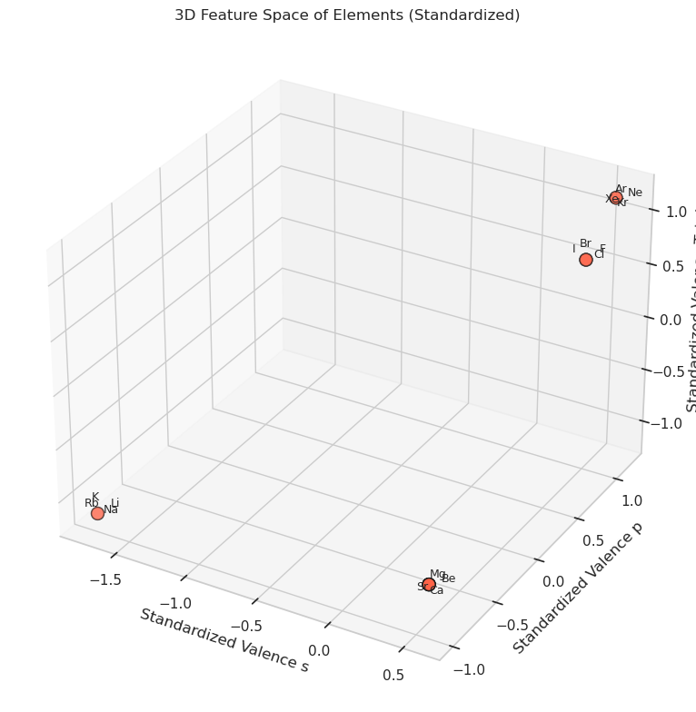
# Axis labels
ax.set_xlabel("Standardized Valence s")
ax.set_ylabel("Standardized Valence p")
ax.set_zlabel("Standardized Valence Total")
ax.set_title("3D Feature Space of Elements (Standardized)")
plt.tight_layout()
plt.show()
import pandas as pd
import seaborn as sns
import matplotlib.pyplot as plt
from sklearn.preprocessing import StandardScaler
from scipy.spatial.distance import pdist, squareform
# Step 1: Define simplified chemistry dataset (replacing He with Xe)
data = {
"Element": [
"Li", "Na", "K", "Rb", # Alkali metals
"Be", "Mg", "Ca", "Sr", # Alkaline earth metals
"F", "Cl", "Br", "I", # Halogens
"Ne", "Ar", "Kr", "Xe" # Noble gases
],
"Group": [
"Alkali", "Alkali", "Alkali", "Alkali",
"AlkalineEarth", "AlkalineEarth", "AlkalineEarth", "AlkalineEarth",
"Halogen", "Halogen", "Halogen", "Halogen",
"NobleGas", "NobleGas", "NobleGas", "NobleGas"
],
"Valence_s": [
1, 1, 1, 1,
2, 2, 2, 2,
2, 2, 2, 2,
2, 2, 2, 2
],
"Valence_p": [
0, 0, 0, 0,
0, 0, 0, 0,
5, 5, 5, 5,
6, 6, 6, 6
]
}
# Step 2: Create DataFrame
df = pd.DataFrame(data)
df.set_index("Element", inplace=True)
# Step 3: Add combined valence column
df["Valence_Total"] = df["Valence_s"] + df["Valence_p"]
# Step 4: Standardize features
features = df[["Valence_s", "Valence_p", "Valence_Total"]]
scaler = StandardScaler()
scaled = scaler.fit_transform(features)
scaled_df = pd.DataFrame(scaled, index=df.index, columns=features.columns)
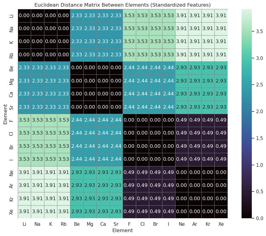
# Step 5: Compute pairwise Euclidean distances
dist_matrix = squareform(pdist(scaled_df, metric="euclidean"))
dist_df = pd.DataFrame(dist_matrix, index=scaled_df.index, columns=scaled_df.index)
# Step 6: Plot the distance matrix as a heatmap
plt.figure(figsize=(10, 8))
sns.heatmap(dist_df, cmap="mako", annot=True, fmt=".2f", square=True, linewidths=0.5, linecolor='gray')
plt.title("Euclidean Distance Matrix Between Elements (Standardized Features)")
plt.xlabel("Element")
plt.ylabel("Element")
plt.tight_layout()
plt.show()
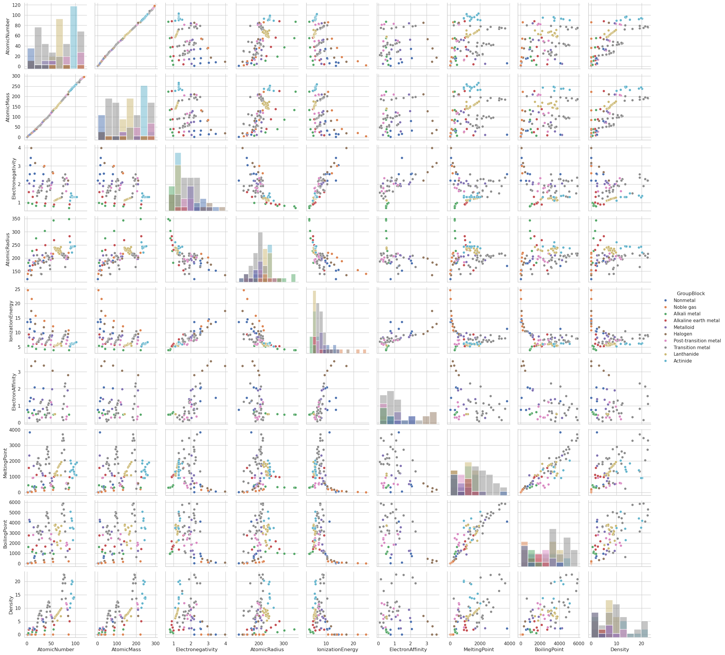
Pair Plots (sns.pairplot())#
The Seaborn function pairplot() is an exploratory data analysis (EDA) tool for visualizing pairwise relationships in a dataset. It creates a grid of scatter plots (and histograms on the diagonals) for each pair of numerical variables.
Plots every numerical variable against every other numerical variable.
The diagonal shows univariate distributions (histograms or KDEs).
Can color points by a categorical variable using the
hueparameter.Can facet rows and columns using
rowandcolparameters.Automatically skips non-numeric columns unless used for coloring or faceting
import pandas as pd
import os
import seaborn as sns
import matplotlib.pyplot as plt

base_data_dir = os.path.expanduser("~/data")  # Parent directory
pubchem_data_dir = os.path.join(base_data_dir, "pubchem_data")  # Subdirectory for PubChem
os.makedirs(pubchem_data_dir, exist_ok=True)  # Ensure directories exist
periodictable_csv_datapath = os.path.join(pubchem_data_dir, "PubChemElements_all.csv")
df = pd.read_csv(periodictable_csv_datapath, index_col=1)
df.head()

sns.pairplot(data=df, hue='GroupBlock', diag_kind='hist')
plt.show()
import seaborn as sns
import matplotlib.pyplot as plt
# Make sure you select only the relevant columns + 'GroupBlock'
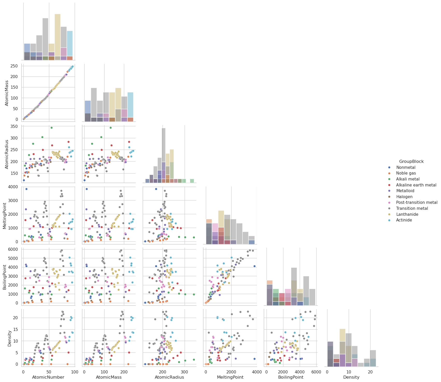
selected_columns = [
'AtomicNumber', 'AtomicMass', 'AtomicRadius', 'MeltingPoint',
'BoilingPoint', 'Density', 'GroupBlock'
]
# Subset the DataFrame
df_subset = df[selected_columns].dropna() # drop rows with missing data
# Create the pairplot
sns.pairplot(df_subset, hue='GroupBlock', diag_kind='hist', corner=True)
# Show the plot
plt.show()
import seaborn as sns
import matplotlib.pyplot as plt
# List the numeric columns and 'GroupBlock'
selected_columns = [
'AtomicNumber', 'AtomicMass', 'AtomicRadius', 'MeltingPoint',
'BoilingPoint', 'Density', 'GroupBlock'
]
# Subset the DataFrame and filter only halogens and noble gases
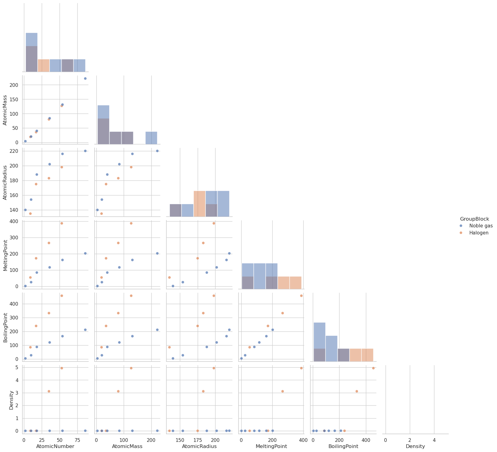
df_filtered = df[selected_columns].dropna()
df_filtered = df_filtered[df_filtered['GroupBlock'].isin(['Halogen', 'Noble gas'])]
# Create the pairplot
sns.pairplot(
df_filtered,
hue='GroupBlock',
diag_kind='hist',
corner=True,
plot_kws={'alpha': 0.7, 's': 40}
)
# Show the plot
plt.show()
import seaborn as sns
import matplotlib.pyplot as plt
# Select and filter your data
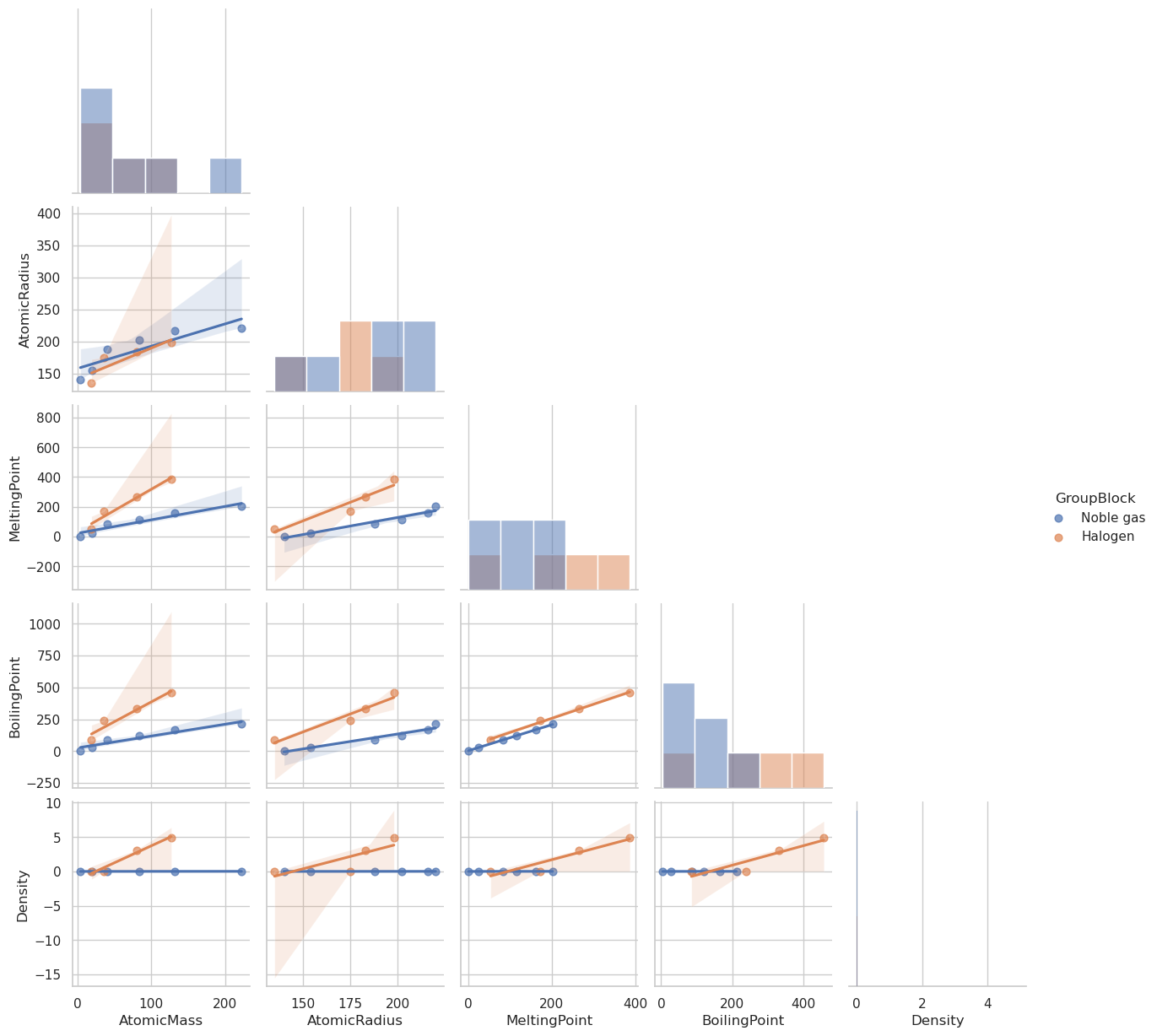
selected_columns = [
'AtomicMass', 'AtomicRadius', 'MeltingPoint',
'BoilingPoint', 'Density', 'GroupBlock'
]
df_filtered = df[selected_columns].dropna()
df_filtered = df_filtered[df_filtered['GroupBlock'].isin(['Halogen', 'Noble gas'])]
# Create pairplot with regression lines
sns.pairplot(
df_filtered,
hue='GroupBlock',
kind='reg', # <-- this adds regression fits
diag_kind='hist',
corner=True,
plot_kws={'scatter_kws': {'alpha': 0.7, 's': 40}} # control point appearance
)
plt.show()
Joint Plot (sns.jointplot())#
import pandas as pd
import os
import seaborn as sns
import matplotlib.pyplot as plt
base_data_dir = os.path.expanduser("~/data") # Parent directory
pubchem_data_dir = os.path.join(base_data_dir, "pubchem_data") # Subdirectory for PubChem
os.makedirs(pubchem_data_dir, exist_ok=True) # Ensure directories exist
periodictable_csv_datapath = os.path.join(pubchem_data_dir, "PubChemElements_all.csv")
df = pd.read_csv(periodictable_csv_datapath, index_col=1)
print(df.head())
# Select and filter your data
selected_columns = [
'AtomicMass', 'AtomicRadius', 'MeltingPoint', 'IonizationEnergy',
'BoilingPoint', 'Density', 'GroupBlock', 'Electronegativity'
]
df_filtered = df[selected_columns].dropna()
df_filtered = df_filtered[df_filtered['GroupBlock'].isin(['Halogen', 'Noble gas'])]
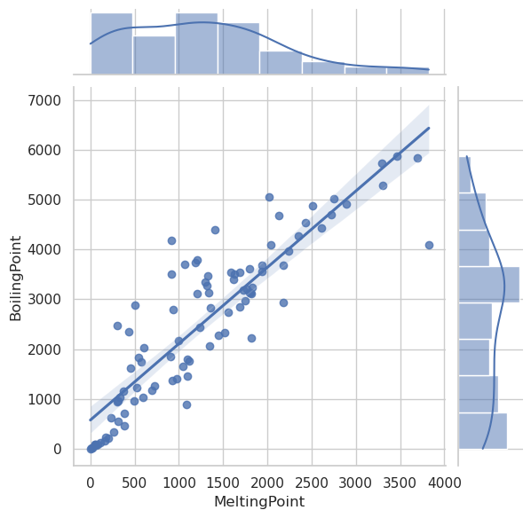
sns.jointplot(data=df, x="MeltingPoint", y="BoilingPoint", kind="reg")
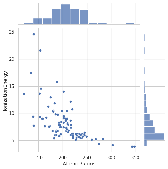
sns.jointplot(data=df, x="AtomicRadius", y="IonizationEnergy", kind="scatter")
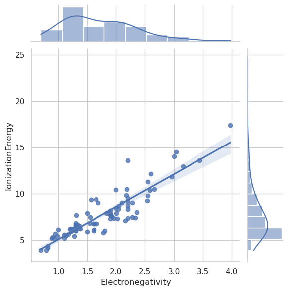
sns.jointplot(data=df, x="Electronegativity", y="IonizationEnergy", kind="reg")
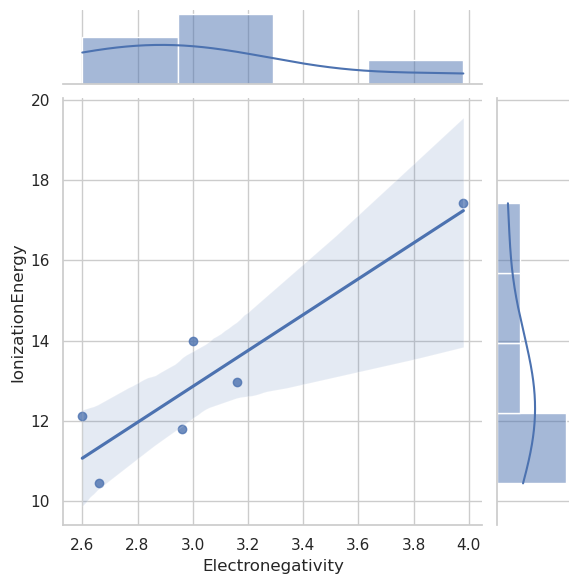
sns.jointplot(data=df_filtered, x="Electronegativity", y="IonizationEnergy", kind="reg")
plt.show()
        AtomicNumber       Name  AtomicMass CPKHexColor ElectronConfiguration  \
Symbol
H                  1   Hydrogen    1.008000      FFFFFF                   1s1
He                 2     Helium    4.002600      D9FFFF                   1s2
Li                 3    Lithium    7.000000      CC80FF               [He]2s1
Be                 4  Beryllium    9.012183      C2FF00               [He]2s2
B                  5      Boron   10.810000      FFB5B5           [He]2s2 2p1

        Electronegativity  AtomicRadius  IonizationEnergy  ElectronAffinity  \
Symbol
H                    2.20         120.0            13.598             0.754
He                    NaN         140.0            24.587               NaN
Li                   0.98         182.0             5.392             0.618
Be                   1.57         153.0             9.323               NaN
B                    2.04         192.0             8.298             0.277

       OxidationStates StandardState  MeltingPoint  BoilingPoint   Density  \
Symbol
H               +1, -1           Gas         13.81         20.28  0.000090
He                   0           Gas          0.95          4.22  0.000179
Li                  +1         Solid        453.65       1615.00  0.534000
Be                  +2         Solid       1560.00       2744.00  1.850000
B                   +3         Solid       2348.00       4273.00  2.370000

                  GroupBlock YearDiscovered
Symbol
H                   Nonmetal           1766
He                 Noble gas           1868
Li              Alkali metal           1817
Be      Alkaline earth metal           1798
B                  Metalloid           1808
import numpy as np
import pandas as pd
import seaborn as sns
import matplotlib.pyplot as plt
# Simulate concentration and absorbance with increasing variance
np.random.seed(42)
concentration = np.linspace(0.001, 1.0, 200)
absorbance = 1.5 * concentration + np.random.normal(0, 0.15 * concentration, size=200)
#
#absorbance = 1.5 * concentration + np.random.normal(0, 0.15 * np.exp(concentration))
df = pd.DataFrame({
"Concentration": concentration,
"Absorbance": absorbance
})
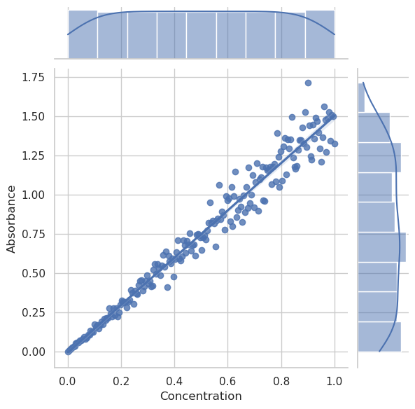
sns.jointplot(data=df, x="Concentration", y="Absorbance", kind="reg")
plt.show()
Acknowledgements#
This content was developed with assistance from Perplexity AI and Chat GPT. Multiple queries were made during the Fall 2024 and the Spring 2025.